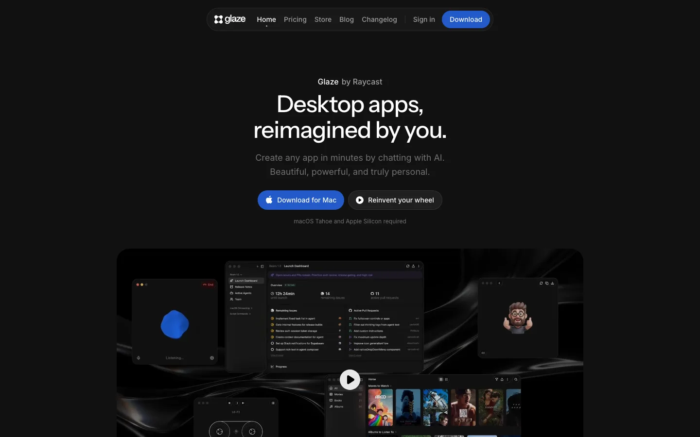
glaze.app2views
Nine details, nine pinned.
View as Markdown ↗Sized by coverage · click to copy.
Video review and collaboration for teams and their agents
ui-sans-serif · 64/69 · 500 · -1.6px
Talk, Draw, Show
ui-sans-serif · 44/48 · 500 · -1.1px
PRODUCT
ui-sans-serif · 12/16 · 500 · 0.6px
Record, draw or type your feedback to easily complex feedback across. Agents can
ui-sans-serif · 16/23 · 400 · -0.16px
Sign Up
ui-sans-serif · 13/20 · 500 · normal
Specimens are the page's own words at their measured metrics; shown in Inter when the family is not loaded.
 123456789
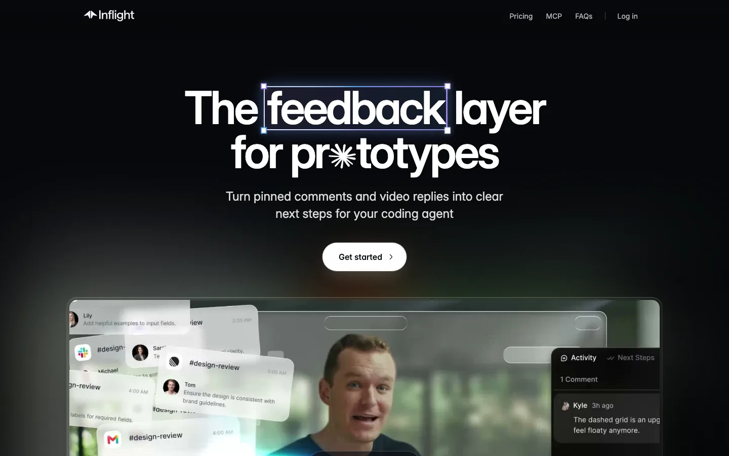
Multiplayer cursors as headline decoration: four arrow cursors with avatar chips (two humans, the ChatGPT and Claude marks) sit on the H1's letterforms in blue, purple and coral, so the "teams and agents" pitch shows up before anyone reads the subhead
A serif-italic wordmark ("flask", Clarendon-like) in an otherwise all-sans system. It is the only typographic warmth on the page and is repeated as the product's own logo inside every mock
Ghost pill nav CTA: 32px tall, 9999px radius, 13px/500 #fafafa text, no fill, only a 1px #2d2d2d hairline, so it barely outranks the 13px gray text links beside it
A dot-matrix halftone field (about 1px dots on a 12px pitch, #2d2d2d) that fades in from the edges below the headline and sits behind the product frame, giving texture without a gradient
The hero product mock is a full app window (breadcrumbs, version chip "v2", a feedback thread with timestamp pills) in a 16px-radius frame with a #2d2d2d hairline, bleeding off the fold so scrolling feels like entering the app
Version compare shown as two thumbnails tagged "v3" / "v2" in tiny dark pills, above stacked scrubbers with monospace 0:00 timecodes, a compact way to sell versioning
Agent work rendered as a chat log of checkmarked steps ("Uploading v3 and its source to Flask") beside the timeline. The agent's output is proof of capability, not a marketing claim
Integrations hub: the wordmark in a dark rounded tile at the center, with app icons (Notion, Claude, OpenAI, Blender, DaVinci) on a faint ring of curved hairlines over the dot field. Only the partner icons carry color
A skeuomorphic feedback composer (chrome mic, screen-record and pencil glyphs in a dark capsule) recurs as the final CTA's eyebrow, so the closing "You know what to do.." is literally the product's input
saas · landing · dark · minimal, dark-techno · premium, technical, calm, futuristic, confident