carlhauser.com1view
Eleven details, eight pinned.
View as Markdown ↗Sized by coverage · click to copy.
Agentic AI - Creating HarmonIQ.
neueMontreal · 24/30 · 400 · normal
Hi, I'm a UK-born, US-based Product Designer using AI workflows to design & ship
neueMontreal · 16/23 · 400 · normal
Aria Intelligent Solutions
neueMontreal · 13/25 · 400 · normal
Specimens are the page's own words at their measured metrics; shown in Inter when the family is not loaded.
 12345789
Stack the wordmark in a high-contrast serif and set literally everything else in one grotesk at one weight. Two lines, second indented right so the name staircases; the serif appears once and never again, so it functions as a logo rather than a typeface choice.
Pixel-art cursors as stickers: a 1-bit pointing-hand and a pixel wire-and-plug doodle in #2159e5, sized ~56px, dropped on top of the wordmark at casual angles so they overlap the letterforms instead of sitting beside them. Hard-edged and unantialiased against a page that is otherwise perfectly smooth.
The hero image is a duotone cutout bled off two edges — a marble Atlas carrying a CRT, flattened to one hue and cropped by the right edge and the fold, with no card, no radius and no drop shadow. It sits directly on the page ground, which is what makes it read as artwork rather than as a screenshot.
Three levels of emphasis inside one ragged-left paragraph: gray for default prose, near-black semibold on the claims, and the accent blue on the links. No underlines, no highlight, no second font — the sentence marks up its own argument.
Icon-only contact row: mail, X and LinkedIn as 1px stroked line glyphs, each trailed by a tiny ↗ set at superscript height. Centered under the paragraph, no labels, no pills, no fills.
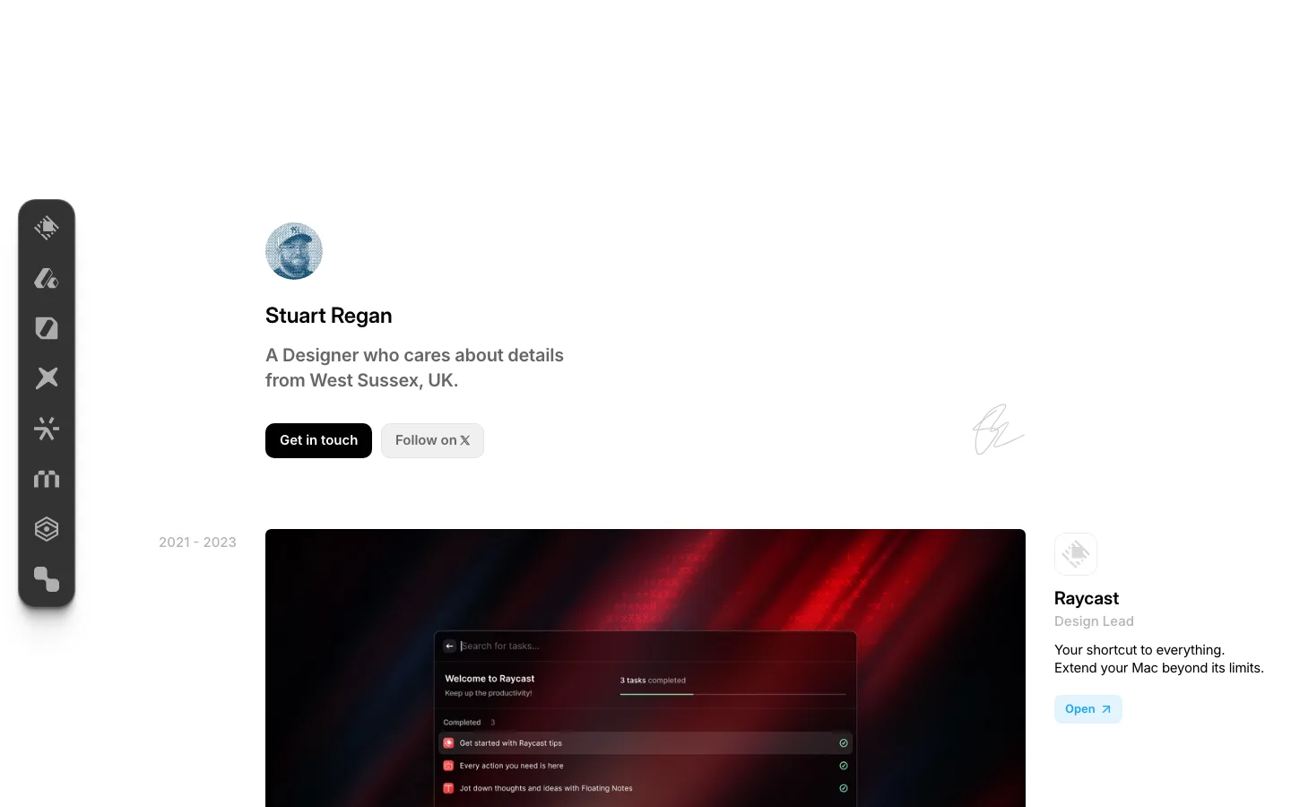
No top navigation. The nav is a fixed bottom bar with no ground and no border — pixel folder glyph, lowercase work fun art about with the active item black and the rest gray, and a pixel external-link glyph at the far right — so the top of every screen is free for content and the chrome never competes with the hero.
Sections are divided by a half-tone step in the ground plus a soft inset shadow along the seam, never a rule. The hero panel is the lighter #f6f6f6; the work section drops to #f1f1f1 and content appears to scroll *under* the lighter plate above it.
Project rows are two columns with a deliberate canyon between them: a 35px-radius media card at ~43% of the width on the left, a text column starting at ~64% on the right, and roughly 20% of the viewport left empty in between. Vertical rhythm is enormous — about 460px of air between one row and the next.
The call to action is not a control. "View project" is a pixel folder icon, plain body-size text, and a pixel double-headed arrow, on no ground at all — the same folder glyph the nav uses, so the icon teaches its own meaning twice on one page.
Every dotted eyebrow is a pair of metadata chips with a • bullet ahead of each half — • Aria Intelligent Solutions • 2025 - 2026 — at 13px/25 in gray, doing the job a tag row or a pill would, at a fraction of the surface area.
All the color lives inside the cards. Purple, amber and teal each belong to a project's own artwork; the page frame stays gray and the only brand color outside the rectangles is the one blue. Three loud pieces of work stay loud without the portfolio around them having to pick a side.
portfolio · landing · light · minimal, swiss, playful · confident, playful, nostalgic, calm