peekpaper.com1view
Eight details, eight pinned.
View as Markdown ↗Sized by coverage · click to copy.
The help center that never goes stale.
Archivo Marketing · 80/80 · 600 · -2.8px
This month, you changed a default.
Archivo Marketing · 64/64 · 600 · -2.24px
Connect your tools.
Archivo Marketing · 24/28 · 600 · -0.48px
Ferndesk is a complete help center with an agent that checks every article again
Inter Marketing · 19/27 · 400 · normal
Start free
Inter Marketing · 13/18 · 500 · normal
Specimens are the page's own words at their measured metrics; shown in Inter when the family is not loaded.
 12345678
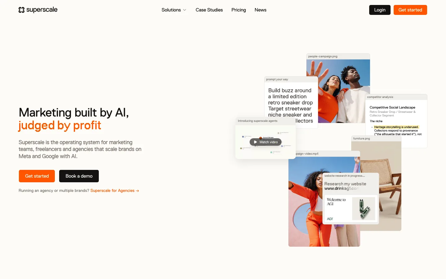
Display type as the whole hierarchy — h1 80px/80px at 600 with -2.8px tracking (-0.035em), h2 64px/64px at -2.24px, h3 only 24px, then a hard drop to 19px body. The three display sizes all sit at a 1.0 line-height ratio, which is what makes each heading read as a solid slab
Tiny controls under huge type — buttons are 13px/500 in a 37px-high pill with 6px radius and 10/16px padding, next to an 80px headline. The ~6:1 ratio between headline and button label is the move; a 16px button would flatten the whole page
Checkerboard dither bands as section seams — every grounds change is bridged by a hand-pixeled 8-bit checkerboard (orange #D56D25 into lime #E1E778 into green), bleeding off both edges, instead of a hairline or a diagonal. It is the one device that makes the page recognizable from a thumbnail
Tabbed product frame carrying the hero — the screenshot sits in a rounded card whose top row is four real tabs (Verification, Help center, Automatic updates, AI conversations) with a "Migrate your docs" link pinned right, so one visual holds four product claims and the hero needs no feature list
Screenshots kept legible, never decorative — the product image runs to a 1,120px content width at roughly 1:1, so 11px UI labels inside it are actually readable rather than a blurred suggestion of an app
Inverted sections that carry a lime highlight — the near-black (#1C1A19) blocks set the heading in white with one phrase in lime, and park a right-hand column of struck-through past states beside it, so the problem is dramatized in type rather than in an illustration
Third testimonial card as the inverse — two video thumbnails in white cards, then a dark card with a lime eyebrow and a pull quote as the third. Breaking the rhythm on the last item of a three-up stops it reading as a stock logo wall
Pixel-sprite row closing the footer — a line of 8-bit characters in the brand's greens, orange, blue and yellow across the very bottom edge, the only purely decorative element on the page and the payoff for the dither bands above it
saas · landing · mixed · retro-warm, editorial, playful · warm, playful, confident, human