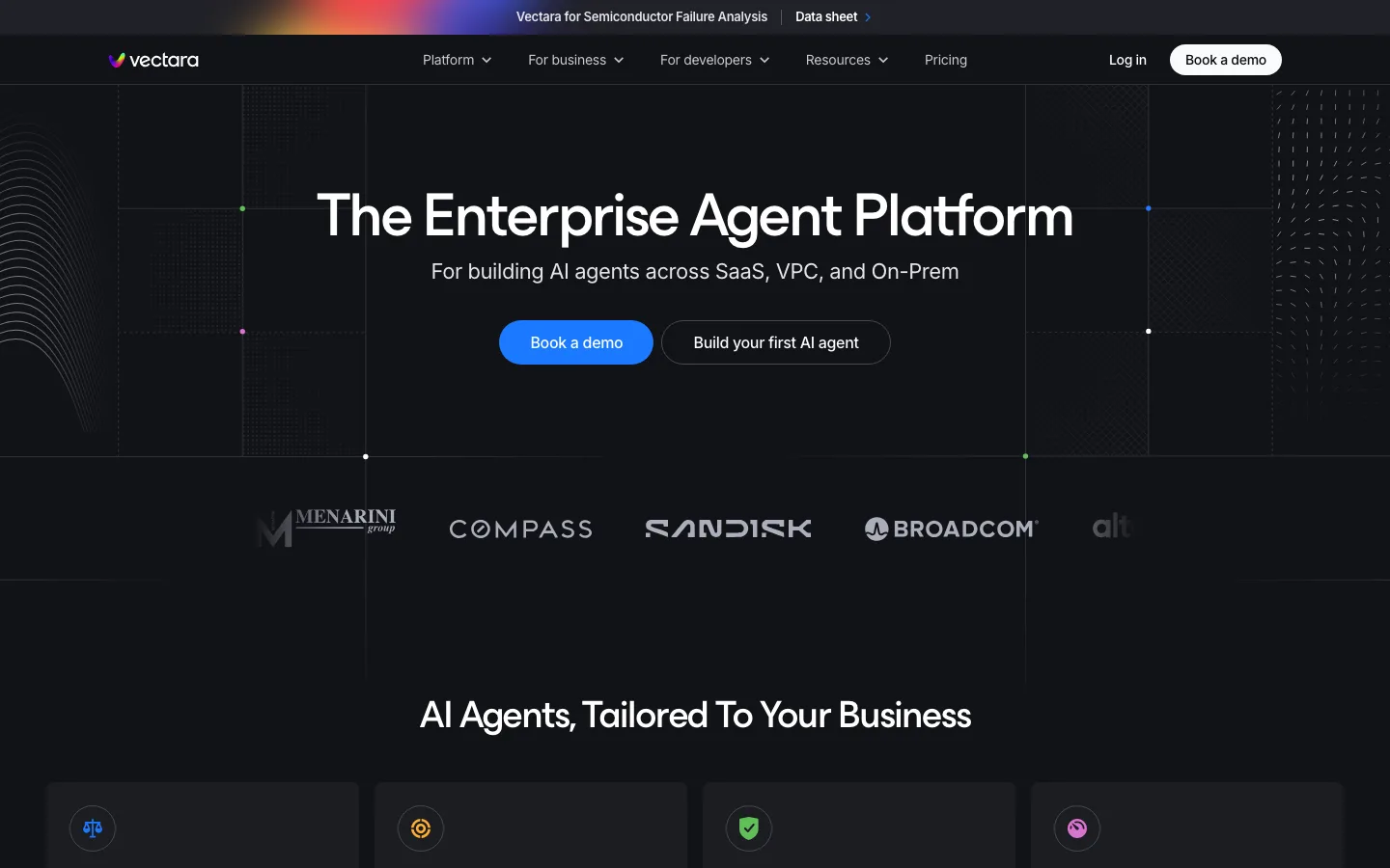
vectara.com0views
Eight details, seven pinned.
View as Markdown ↗Sized by coverage · click to copy.
Modern customer support & feedback platform
__Inter_f367f3 · 48/66 · 500 · -0.96px
Support your customers with AI, collect feedback, and announce product updates —
__Inter_f367f3 · 23/35 · 400 · normal
Discover all Support Platform features
__Inter_f367f3 · 14/20 · 500 · normal
Powering the world's leading startups and enterprises
__Inter_f367f3 · 18/28 · 400 · normal
Support
__Inter_f367f3 · 13/20 · 500 · normal
Specimens are the page's own words at their measured metrics; shown in Inter when the family is not loaded.
 2345678
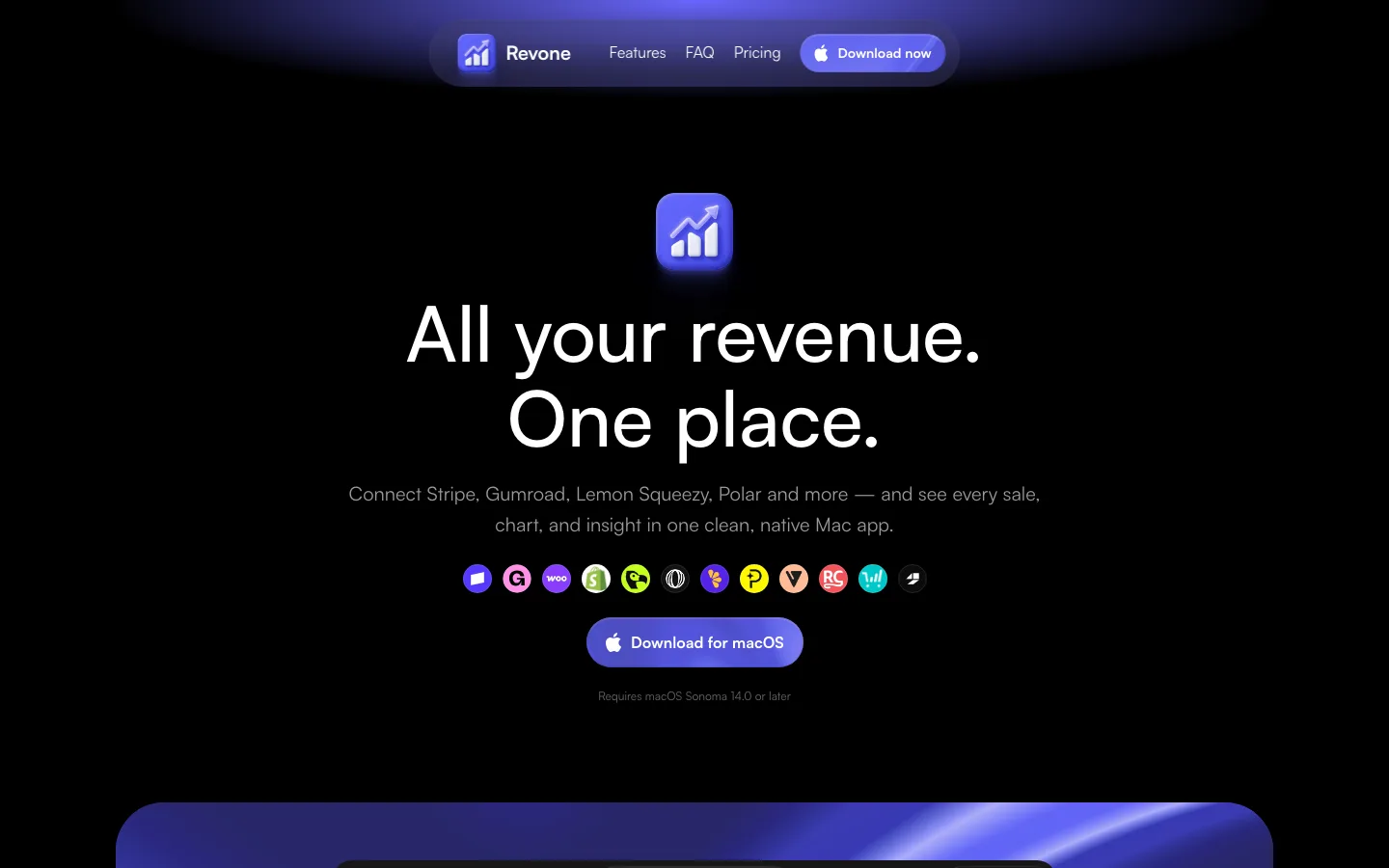
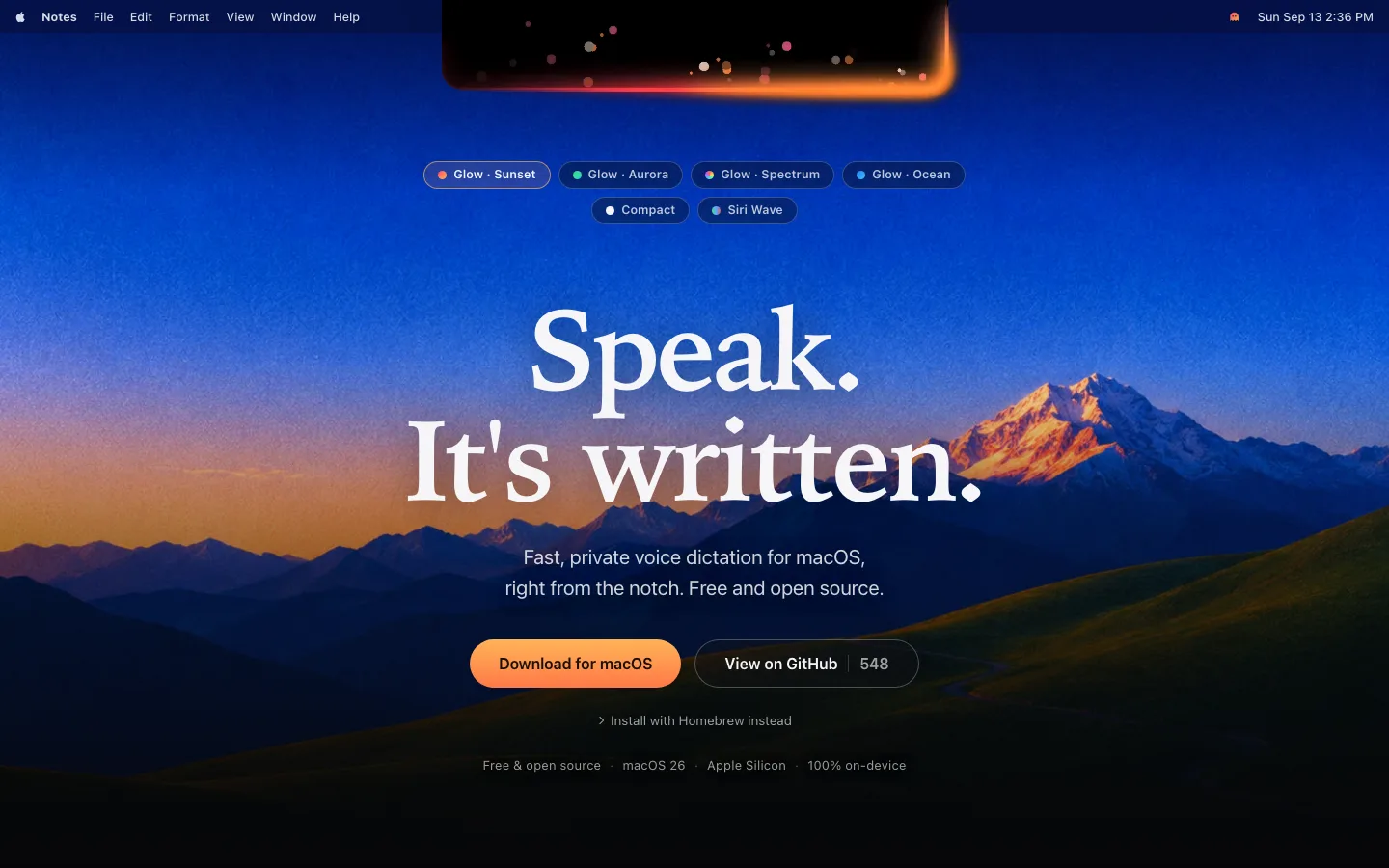
Near-black, not black — the page is #050608 and the dominant surface #0f0f18, with panels at #2a2b39 and dividers at #4d4f5a; the 4–6% luminance steps are the only separation, so almost nothing needs a border
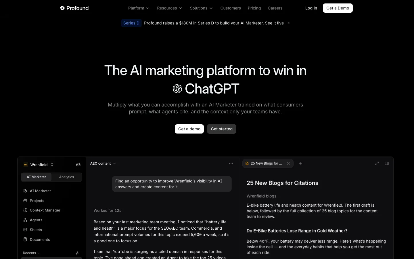
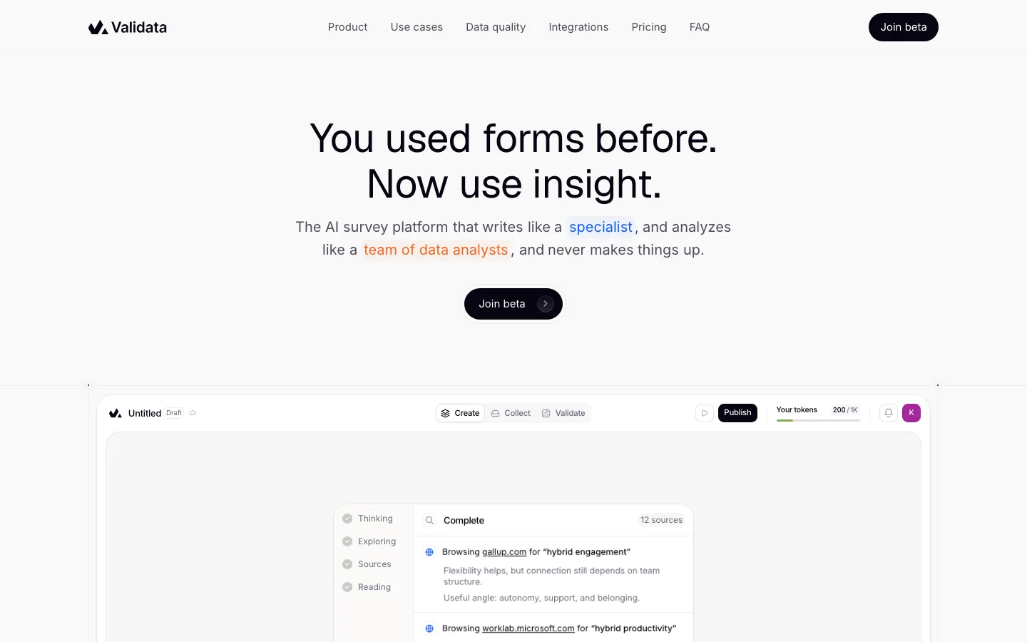
Centered hero that gives the fold to the product — headline, one 23px subhead line, two buttons, then the app mock starts at ~70% of viewport height and is deliberately cropped by the bottom edge so the page reads as already in use
Announcement pill above the headline — a fully rounded (9999px) hairline chip with 13px text and a chevron, used for recruiting rather than a launch, sitting in the space a kicker would take
Inverted primary button — solid #ffffff with a #101219 label, 14px/600, 12px radius, 38px tall on 8px/16px padding; the secondary is the exact same shape in a lifted gray, so the pair differs only in value
Tab bar as a section switcher over the mock — five icon+label tabs at 13px/500 spread edge to edge, the active one marked by a bright hairline along its top edge instead of a filled pill
Violet rim-light around every product screenshot — the mock sits in a 16px-radius frame whose border is a blurred purple glow rather than a stroke, which makes a flat UI capture read as lit and embedded instead of pasted on
Three-up feature row under each mock — a thin line icon, a 20px/600 title, 15px muted body, split by vertical hairlines with no card fill, so the notes annotate the screenshot above rather than compete with it
Testimonials as hairline rows, not cards — the quote sits left at ~17px, the customer's own logotype right in its real brand form, with a small avatar and attribution beneath; no panel, no quote mark, no stars
saas · landing · dark · dark-techno, corporate-clean, minimal · confident, technical, trustworthy, premium