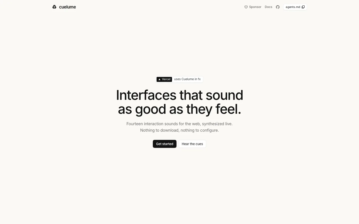
cuelume.dev9views
Ten details, eight pinned.
View as Markdown ↗Sized by coverage · click to copy.
Esqia
inter · 30/36 · 550 · -0.75px
How It Works
inter · 20/28 · 550 · normal
An easy way to edit MDX directly on your page.
inter · 17/26 · 400 · normal
next.config.ts
paperMono · 13/20 · 400 · normal
Specimens are the page's own words at their measured metrics; shown in Inter when the family is not loaded.
 12345678
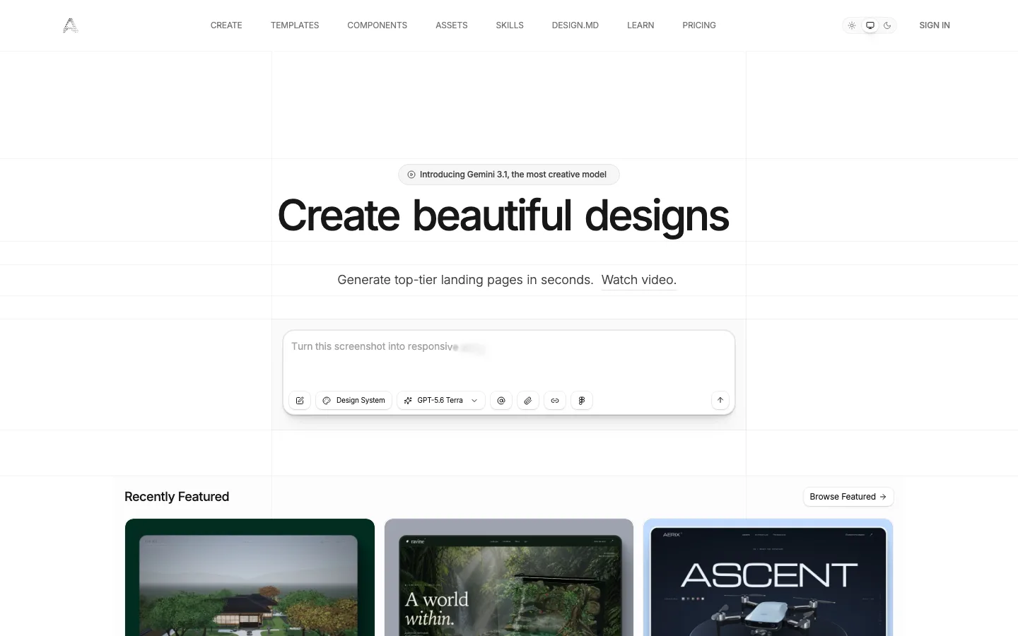
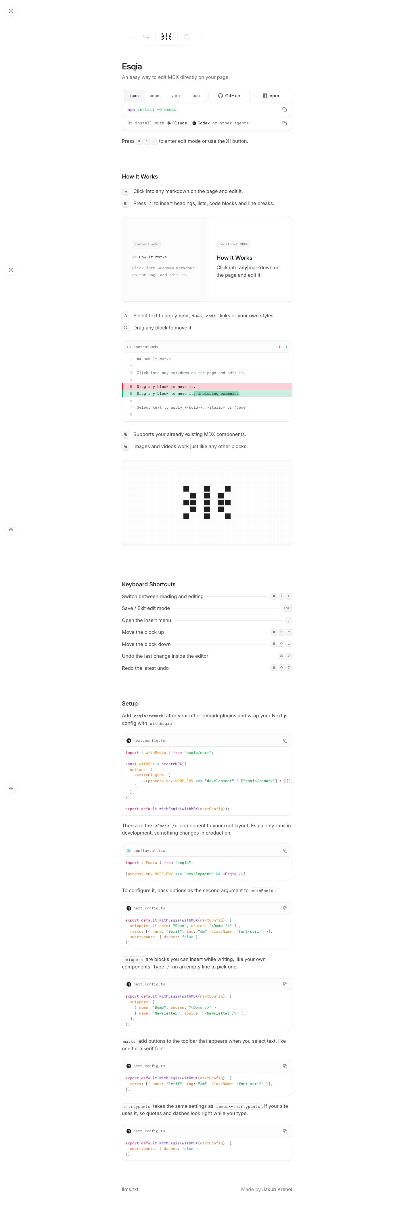
The product's own toolbar sits above the title as the hero: undo, redo, the logo, reset and a menu in a pill that fades out at both ends, with the inactive icons washed to #d2d3d2. It shows the tool instead of describing it
The install block is one framed unit: a segmented npm/pnpm/yarn/bun switcher, GitHub and npm buttons as sibling tiles, then the command row and an "install with Claude, Codex" agent row, each with its own copy icon. Install, links and alternatives fit into about 150px
Shortcuts are written inline as tiny bordered keycaps (⌘ ⌥ E) at about 11px mono inside 17px body text, so the instruction reads as one sentence
The feature list uses 28px soft-gray icon tiles instead of bullets. Each line is one short sentence, so the list scans like a changelog
A side-by-side split card puts content.mdx raw markdown on the left and the rendered localhost:3000 page on the right, each tagged with a mono chip. It shows the before and after in a single frame
The diff card has a mono gutter and pale red/green rows with a solid 3px left bar, and only the changed words get a stronger green highlight. It is a quiet way to show an edit
The keyboard-shortcut table uses dotted leaders: each label runs into a 1px hairline that ends in right-aligned keycap clusters. It is a menu-card pattern turned into docs
The logo is enlarged on a faint 1px square grid inside a framed tile, so the pixel mark doubles as the illustration
A small round button stays pinned to the top-left corner as the editor's entry point. It is the only chrome on the page
Every container is a double shell: a 16px-radius outer ring with about 4px of padding around a 12px-radius inner card, both drawn with #ececec-ish hairlines. It gives depth without a single shadow
saas · landing · light · minimal · technical, calm, confident, elegant