brianlovin.com1view
Eight details, six pinned.
View as Markdown ↗Sized by coverage · click to copy.
My new course called aiforui.dev is in early access! Early access has closed.
Sans · 14/23 · 400 · normal
Specimens are the page's own words at their measured metrics; shown in Inter when the family is not loaded.
 134578
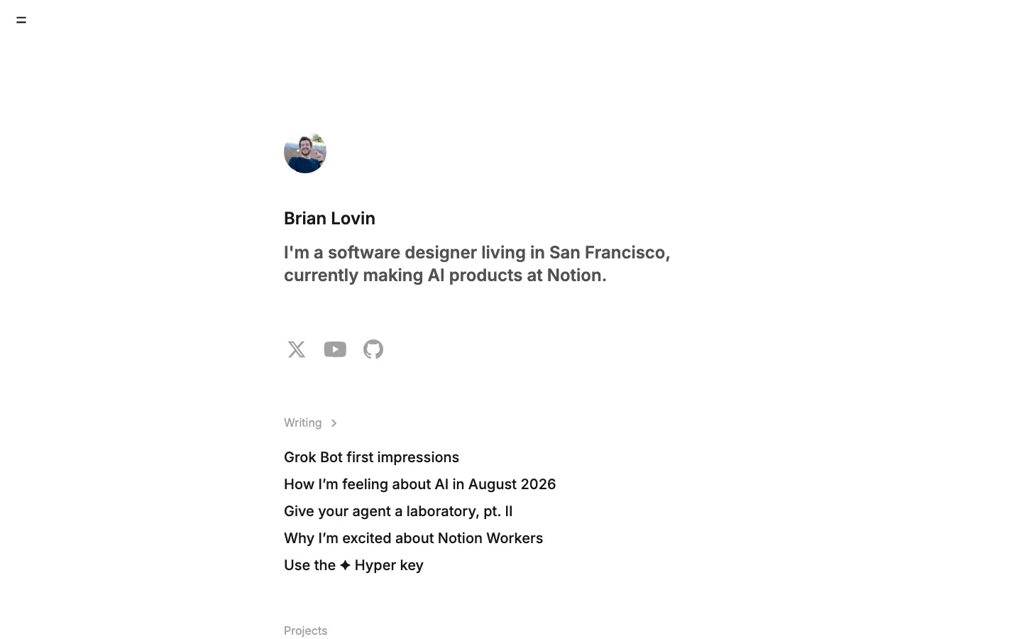
One measure, centered, left-aligned inside — a ~630px column on a 1440px viewport, so the text block reads as a page rather than a layout, and the whitespace is all margin rather than gutter
One type size for the whole document — 14px/400 at 23.1px line-height for headings, section labels, titles and body alike; the only exception on the page is the 16px/500 button label. Hierarchy comes from color and space, never from scale
The masthead is two lines of body text — name in ink, role in gray, no bar, no logo, no navigation, nothing sticky. The page starts ~130px down with an ordinary paragraph that happens to be your name
Section labels are the same size as body copy and are separated only by weight and by ~70px of air above them; drop the rule, drop the uppercase tracking, and let the emptiness do the announcing
Two-line list rows as the universal content unit — ink title, gray one-sentence description directly beneath, ~64px between rows and no bullet, number, date, tag or thumbnail. Projects and writing use the identical row, so the page has exactly one list pattern
Warm neutrals instead of pure black and white — the ground is #fdfdfc rather than #fff, the ink #21201c rather than #000, and the hairlines step down through #d0d0ce and #b6b6b4; nothing on the page is fully saturated
The newsletter field is a pill inside a pill — a 9999px white capsule with a hairline and a soft shadow, holding a 38px solid #21201c pill button flush to its right inset, label 16px/500 in #fdfdfc. It is the only filled, rounded, shadowed object on the page and so it reads as the one call to action without any color
The page closes on a sentence, not a footer — one line of prose with the social destinations as inline underlined text links rather than an icon row
portfolio · landing · light · minimal, editorial · calm, confident, elegant, human