ramintahbaz.com7views
Six details, five pinned.
View as Markdown ↗Sized by coverage · click to copy.
Dominik Martin
Geist · 17/24 · 500 · normal
SIDE PROJECTS
Geist Mono · 10/15 · 500 · 0.6px
I design and build digital products, from positioning and brand to interface and
Geist · 17/24 · 400 · normal
Specimens are the page's own words at their measured metrics; shown in Inter when the family is not loaded.
 13456
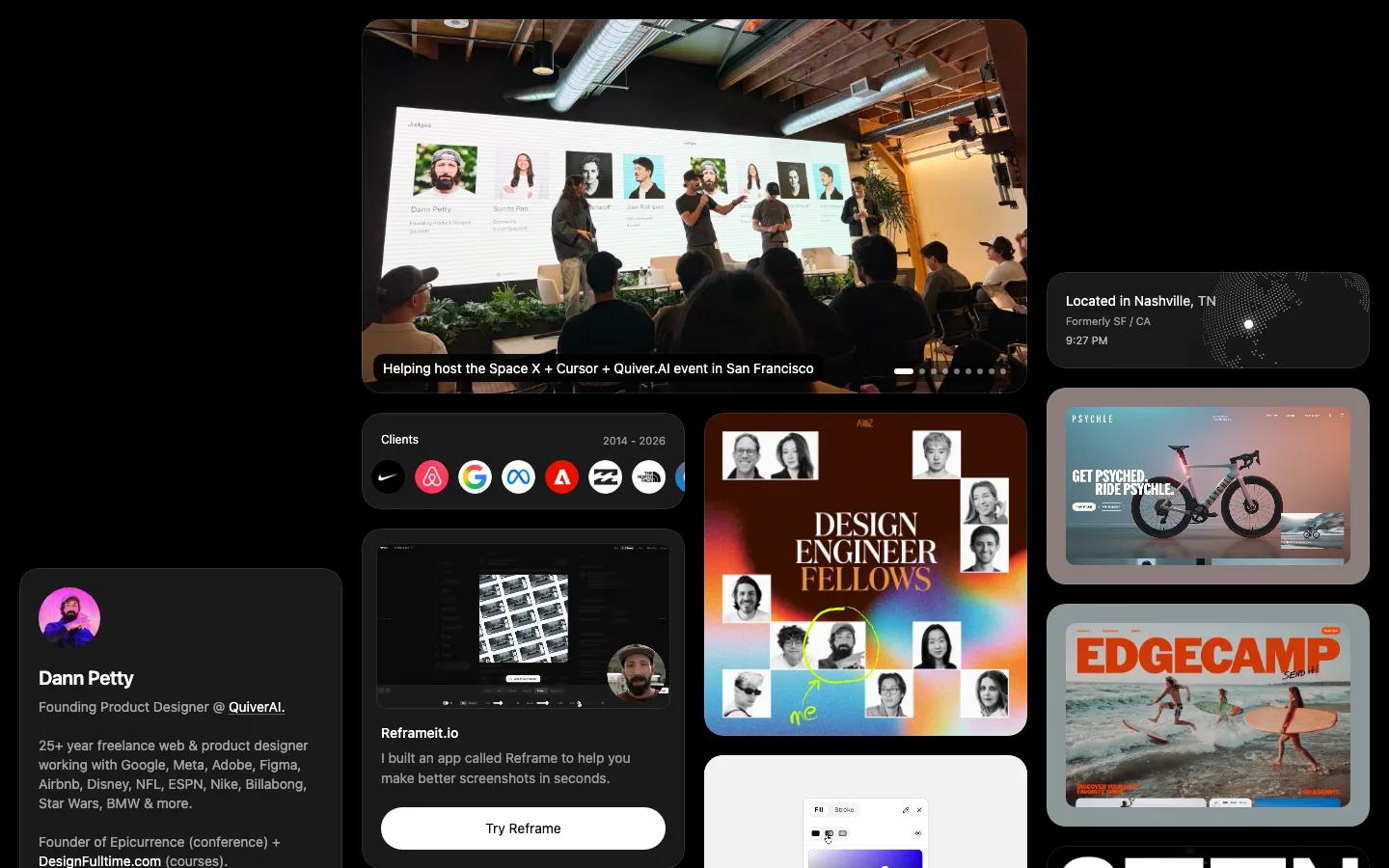
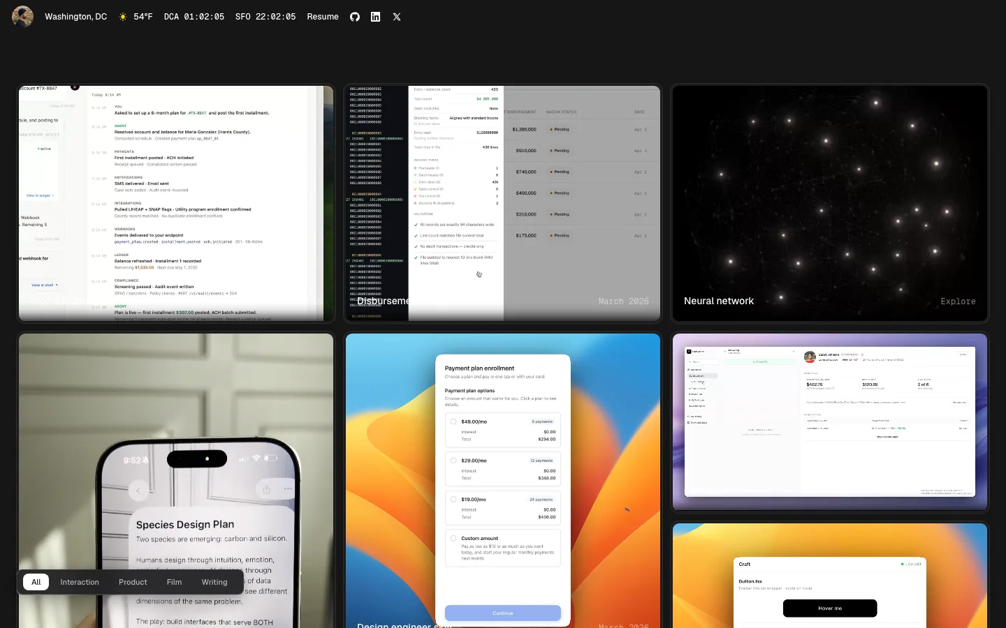
Work-as-wall masonry: three equal columns of uncaptioned shots at an 8px gutter, mixed aspect ratios so the column bottoms never line up, no titles, no hover text, just the images butting together
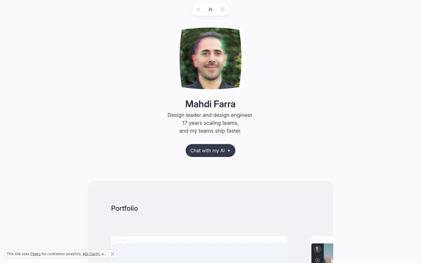
Sticky identity rail: the entire bio, CTA, side projects and services live in a fixed right column (~30% width) on a #f8f8f7 wash while only the left wall scrolls, so the pitch and "Book a call" never leave the screen
One-size type system: name (500), pitch, list titles and the CTA all set at 17px/1.4 Geist; hierarchy comes only from weight 500 vs 400 and gray #6f6e6f secondary lines, never from size
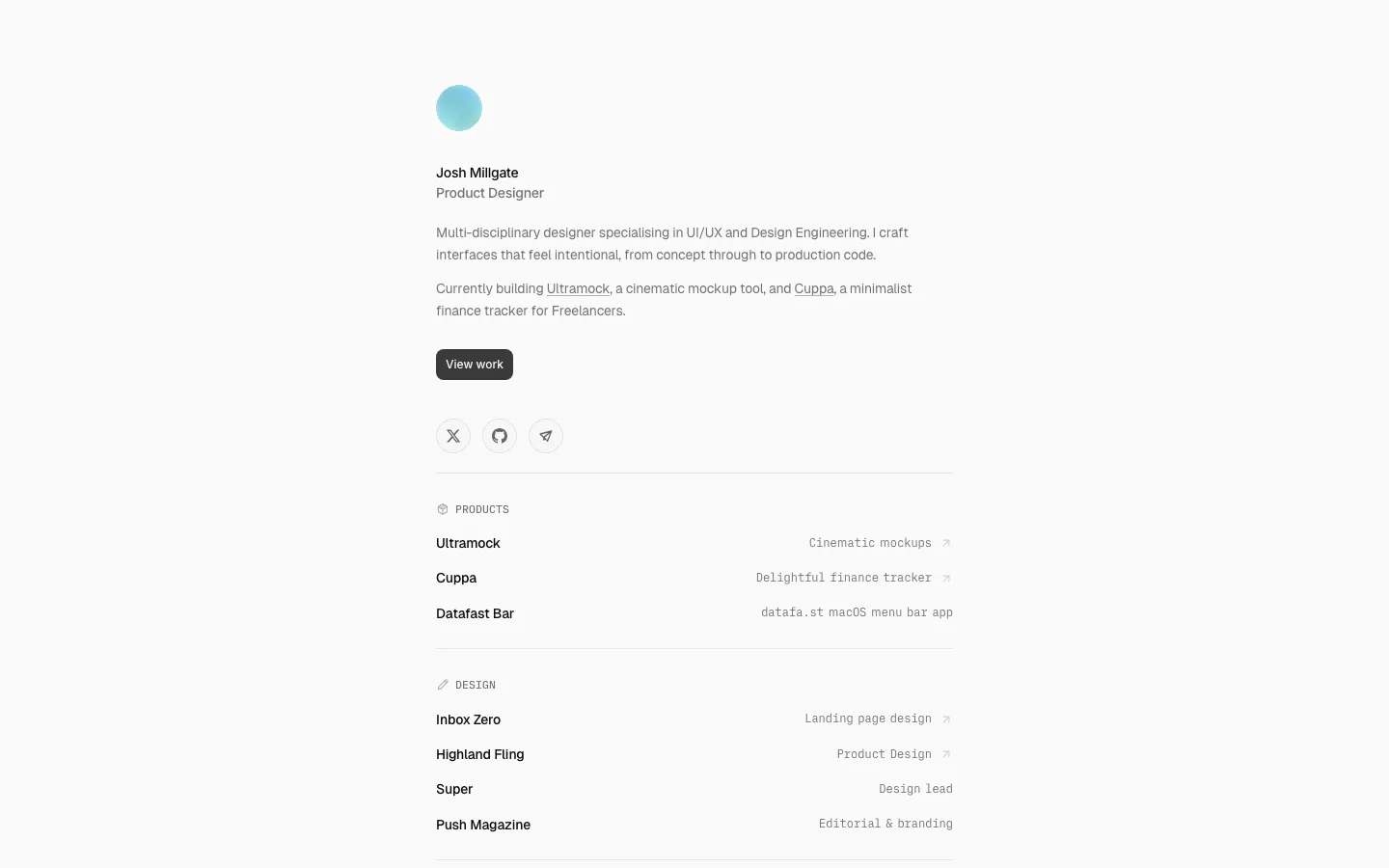
Mono micro-labels: section heads like "SIDE PROJECTS" in Geist Mono 10px, weight 500, 0.6px tracking, uppercase, mid-gray, as the only label style on the page
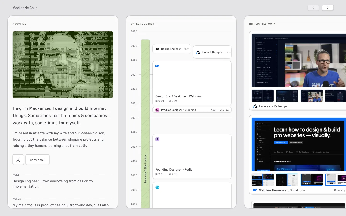
App-icon list rows: each side project is a 36px rounded app icon, a 17px name and a gray one-line tagline beneath, stacked at ~56px rhythm inside a white 12px-radius card with no dividers
Black pill CTA plus bare icon row: one #0a0a0a 44px button with 12px radius, then X, GitHub, LinkedIn and a dot-grid glyph as unboxed 20px gray icons on the same baseline
portfolio · landing · light · minimal, bento · confident, calm, technical, premium, human