delphi.ai1view
Ten details, nine pinned.
View as Markdown ↗Sized by coverage · click to copy.
More than a browser. A better workday.
Exposure VAR · 39/43 · 500 · -1.55172px
Dia reads between the tabs
Exposure VAR · 48/56 · 500 · -2.4px
Create clean lines between work, freelance, and personal life, with separate tab
ABC Oracle · 20/30 · 350 · -0.4px
Before the day kicks in, Dia's Morning Brief lays it all out (calendar, inbox, k
ABC Oracle · 14/20 · 400 · normal
Specimens are the page's own words at their measured metrics; shown in Inter when the family is not loaded.
 1235678910
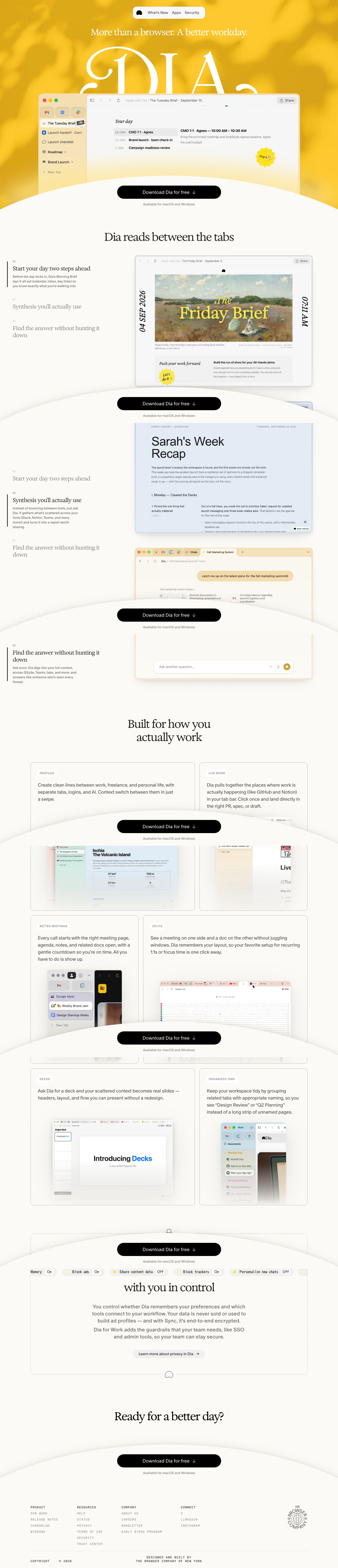
Floating pill nav: a white chip with a 12px radius, a soft shadow and a 1px warm border, holding only a logo glyph and three text links, centered over the hero with no bar behind it
Oversized ornamental wordmark (a swash serif at about 3x the headline's size, white) set behind the product window, so the window's top edge crops the letters and the brand reads as a backdrop, not a logo
Blurred photographic wash instead of a flat brand fill: dappled light and leaf shadows in two yellows give the hero depth and warmth at no layout cost
Bottom-docked CTA sheet: a cream ellipse rises from the viewport floor, carrying a 56px black pill ("Download … ↓", 20px at weight 350) and a 13px gray platform note, fixed through the whole scroll
Product UI tinted to the brand: the window chrome and sidebar pick up a translucent butter tone (#f5e1ad), with an italic serif section label ("New updates") inside the app copy, so the screenshot shares the page's typography
Scrollytelling step list: mono "01/02/03" indices over light serif step titles. Inactive steps fade to gray, and the active one gets a 2px black left rule plus body copy
Editorial cover card: a briefing mock framed by rotated italic-serif date and time running up both sides, like a magazine spine
Feature cards with hairline borders, a 16–20px radius and an uppercase tracked tag in a small rounded chip ("BETTER MEETINGS"), then 18–20px body copy and a cropped product shot bleeding off the card's bottom
Privacy settings as a ticker: a row of monospaced "Memory On · Block ads On · Share content data Off" toggles turns a trust section into a readable strip
A round "The Browser Company" seal stamped in the footer corner, a signed-by-the-maker detail
saas · landing · light · editorial, minimal · warm, optimistic, calm, human, premium