Dia · Oct 20261view
Seven details, six pinned.
View as Markdown ↗Sized by coverage · click to copy.
What's on your mind
fontPythia · 50/51 · 500 · -1.75px
Quick questions
fontInter · 20/28 · 500 · -0.5px
How do I host a dinner party that actually feels effortless?
fontInter · 23/30 · 500 · -0.46px
CREATIVITY
fontPythia · 11/11 · 600 · 0.99px
Specimens are the page's own words at their measured metrics; shown in Inter when the family is not loaded.
 123567
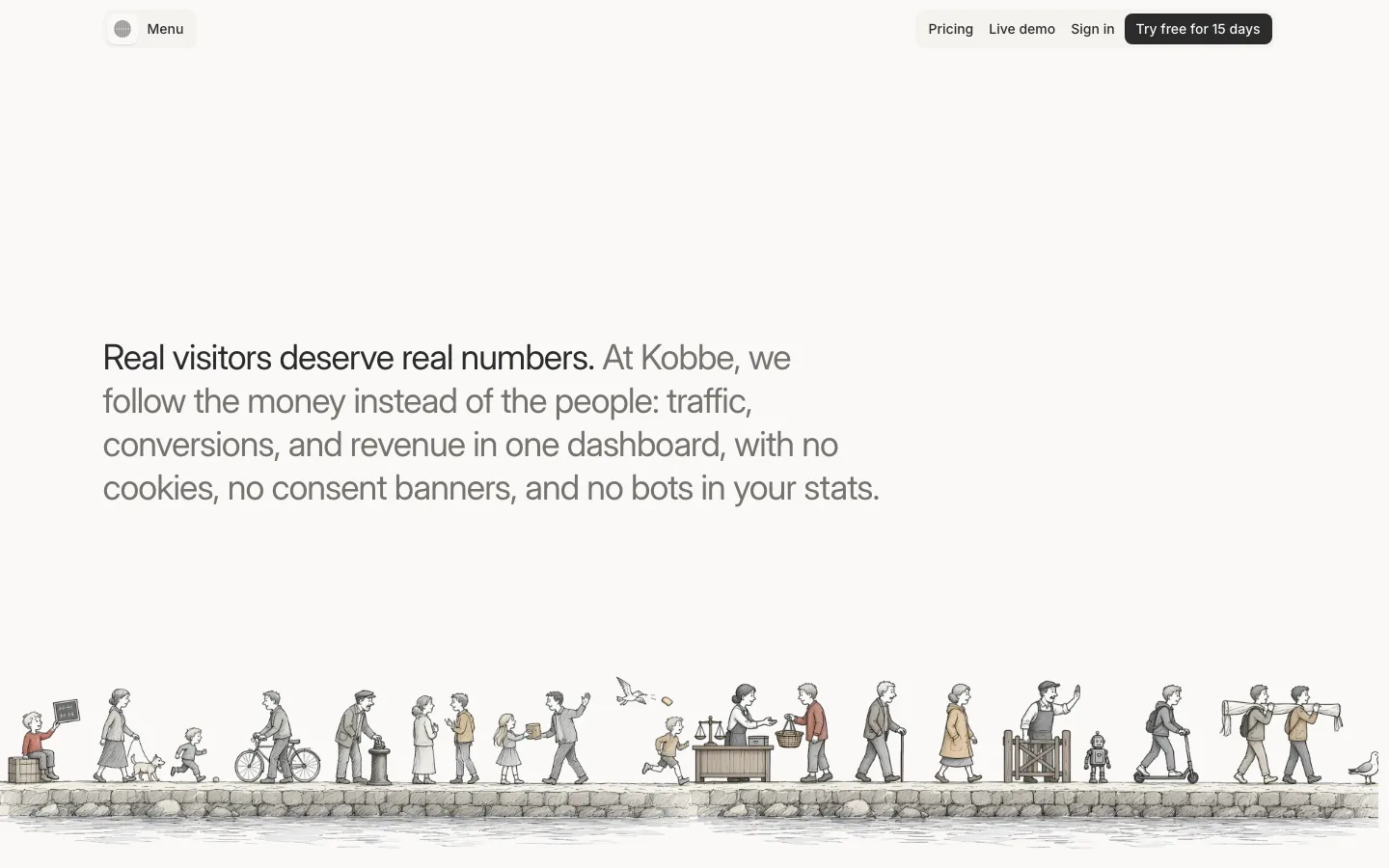
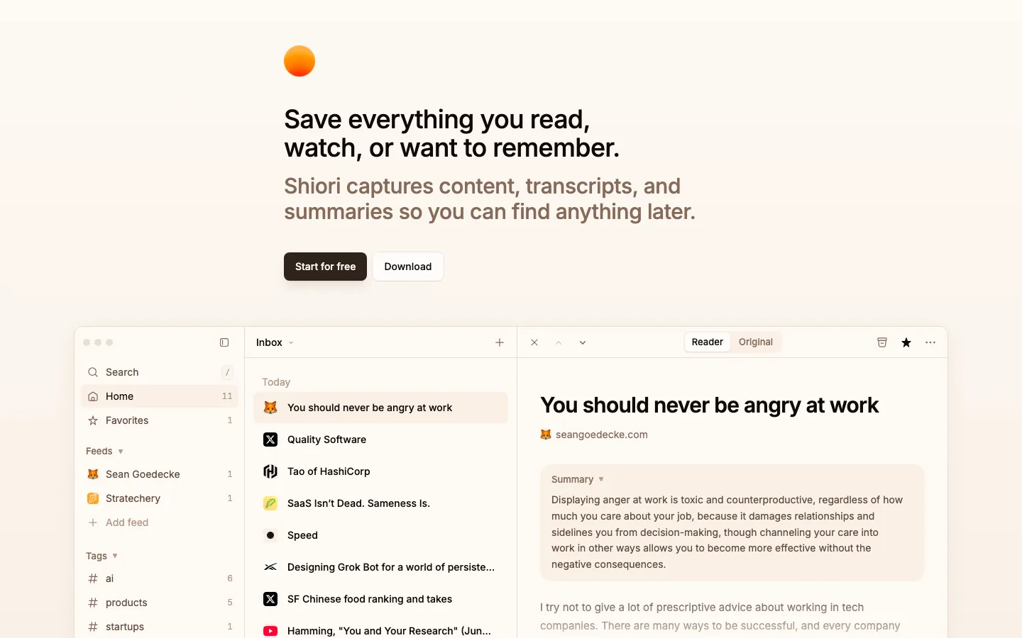
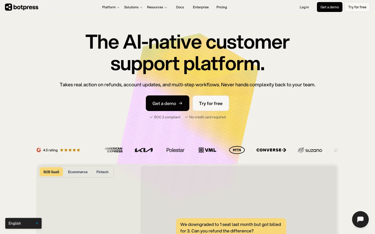
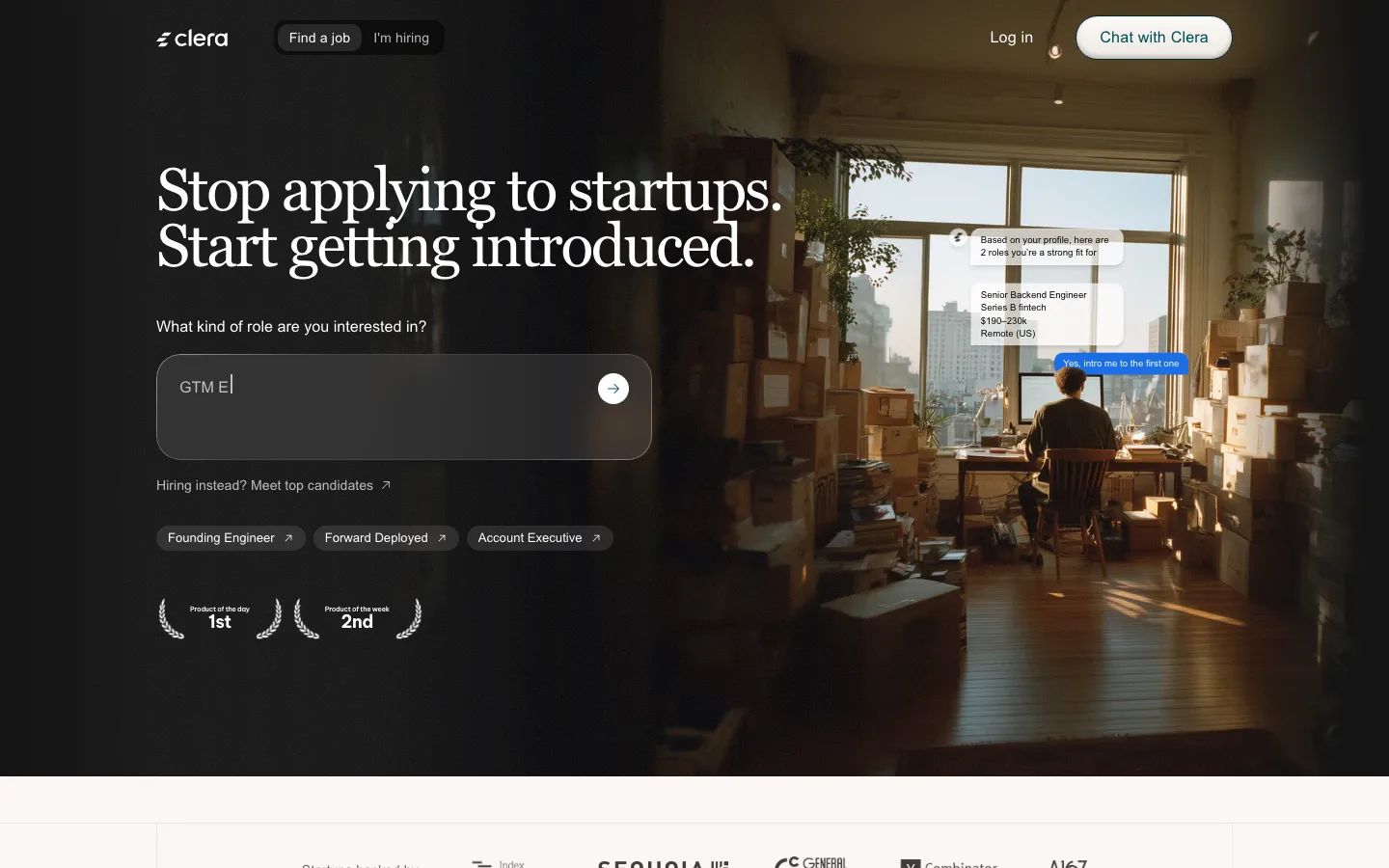
Arch-topped portrait card (140px top radius over 12–16px corners): the photo bleeds to the edges, the name is set in the serif in white, and a dark rounded chat input with an orange pill CTA sits inside the card's lower edge — the product demo *is* the hero image.
Scattered "paper chip" cards rotated ±10–20°, each a tiny fact (source icon + label + count) or a mock reply in orange text — a warm, tactile way to show breadth of data without a feature grid.
Two-tone CTA pair: a cream secondary (#f0e6dc on #2b180a text, 12px radius, 45px tall) beside one solid orange primary — the orange is used nowhere else in the hero, so it owns the eye.
Tonal layering instead of borders: 12–16px-radius cream cards on a slightly lighter cream ground, with dotted orbit rings at ~3% contrast as decoration.
Source pills (icon + word) placed on concentric orbits around a portrait — a diagram that doubles as illustration.
Chat-bubble mock as a feature illustration: the user's question in an orange bubble, the answer in a cream bubble, set inside a card headed by a serif line.
Serif headlines kept to two lines with a full stop each — "Meet a mind. Ask it anything." — full stops make the light serif feel decisive.
saas · landing · light · editorial, minimal, retro-warm · warm, premium, human, elegant, calm