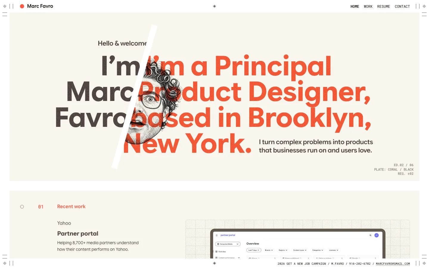
marcfavro.com2views

Eight details, eight pinned.
View as Markdown ↗Sized by coverage · click to copy.
Hey! I'm Daniel Sun, a designer who brings trusted clarity into your web and bra
LT Superior Serif Regular · 64/72 · 400 · -3px
6+ years designing for tech founders. Seed to Series C, across fintech, dev tool
EB Garamond · 20/24 · 400 · 0.1px
Specimens are the page's own words at their measured metrics; shown in Inter when the family is not loaded.
 12345678
The layout grid is the decoration — a faint graph-paper texture on the #fcfcfb ground, 1px #cfcfce column rules left visible, and small square crop-mark ticks drawn at every rule intersection, so the page shows its own construction instead of a background image
The only saturated color above the fold is a soft yellow radial wash (#fbfdc4) bleeding down from the top edge into white — a pure gradient standing in for a hero image, with nothing sitting on top of it
Two serifs, one sans, strictly by role: display serif at 64px/72px weight 400 with a very tight -3px track; EB Garamond 20px/24px italic for the caption line under the fold; sans only at 12px inside buttons and chips, where it reads as UI rather than as voice
The primary CTA is a glossy beveled black pill — 40px tall, 10px radius, white 12px label, an inner top highlight and a soft drop shadow — one deliberately skeuomorphic object against otherwise flat type, with a small play triangle as its trailing glyph
The header has no nav bar at all: a segmented pill of two labeled tabs with sun and moon glyphs sits far left, the name is optically centered as plain text, and a second dark pill sits far right — three zones on one hairline, no fill, no border
Project cards are labeled by a chip row that overlaps the bottom edge of the media rather than a caption beneath it — one light chip for the client name, then dark 7px-radius chips for each discipline, all in 12px sans
The client logo wall is a ruled table, not a strip: 5x3 hairline cells with one centered mark per cell, so the grid handles the rhythm and no logo needs individual optical spacing
Services are four hairline quadrants with no cards and no shadows — a 3D emoji-style icon, a serif heading at reading size, and three lines of small body copy, the dividers doing all the containment work
portfolio · landing · light · editorial, swiss, playful · warm, confident, human, optimistic