letters.app1view
Nine details, nine pinned.
View as Markdown ↗Sized by coverage · click to copy.
AI ads that learn, perform and stay on-brand
PolySans-Median · 64/64 · 600 · -0.64px
Never run out of ads that work.
PolySans-Median · 48/48 · 600 · -0.48px
Predict what’s next
PolySans-Median · 28/32 · 600 · -0.28px
For eCommerce teams who need more ads, faster, without losing their edge.
BeausiteClassicWeb · 18/26 · 400 · normal
Specimens are the page's own words at their measured metrics; shown in Inter when the family is not loaded.
 123456789
Two-tone headline: the subject in near-black (#1a1a1a), and the payoff clause ("learn, perform and stay on-brand") in the brand violet. The color itself carries the emphasis, so the headline needs no underline or highlight.
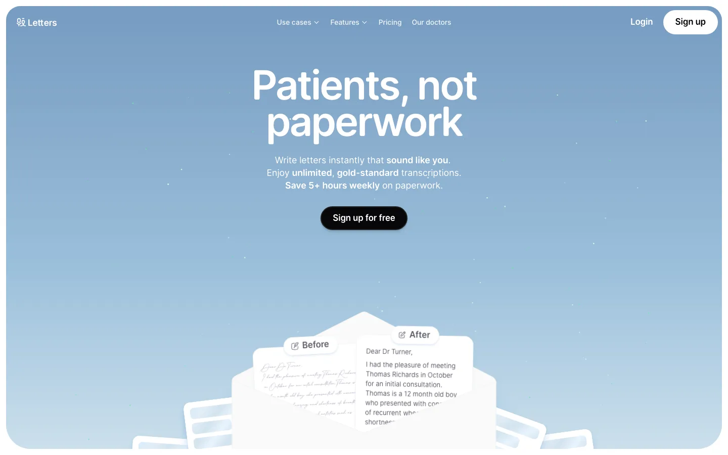
Proof-stat eyebrow pill: a white capsule with a hairline border, a small lime status dot and monospace uppercase "$260M+ IN META SPEND ANALYZED". It reads like a live system readout, not a marketing badge.
Collage scraps tucked behind the product frame: a map fragment, a torn chartreuse paper texture and violet dot grids poke out from behind the 16px card. The page gets a handmade, editorial edge, and the UI itself stays clean.
Dashed hairline rules instead of solid ones: under the nav, between integration columns and under section intros. The dashes keep the light page structured without looking heavy.
Stat row with tiny graphic glyphs collided into the numerals: overlapping violet circles behind "4.4x", a grass-texture strip under "37%", and lime-and-violet leaf shapes before "14x". Each big number gets its own small illustration.
Halftone engraving objects (an eye, a brain, a beige computer) on white feature cards. The vintage clip-art texture plays against the AI subject matter and makes the product feel human.
Full-bleed violet band with a radial bloom: one section floods #634cff and fades to a lighter lavender glow behind a floating ad-card mockup. It is the page's only saturated surface, so it lands as the climax.
Torn-paper edge from the light page into a near-black footer, which closes on an edge-to-edge wordmark-scale tagline ("Create. Results.") cropped by the viewport.
A pale mint (#d9f8d4) integrations card sits next to the white cards. It is the only pastel surface in the system and marks the integrations block as a separate zone without another accent.
saas · landing · light · minimal, corporate-clean, organic · confident, optimistic, human, friendly, energetic