ultramock.io4views
Eight details, eight pinned.
View as Markdown ↗Sized by coverage · click to copy.
Cursor is your coding agent for building ambitious software.
CursorGothic · 26/33 · 400 · -0.325px
Trusted every day by teams that build world-class software
CursorGothic · 14/21 · 400 · 0.14px
Agents turn ideas into code
CursorGothic · 22/29 · 400 · -0.11px
Software creation is changing. We are a group of researchers, engineers, and tec
EB Garamond · 17/23 · 400 · normal
Specimens are the page's own words at their measured metrics; shown in Inter when the family is not loaded.
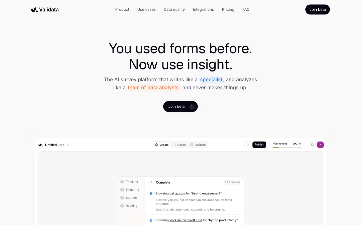
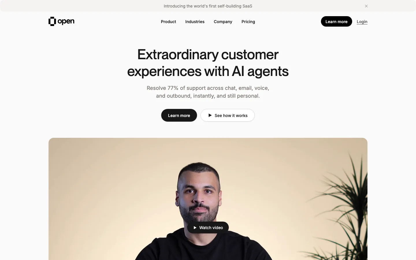
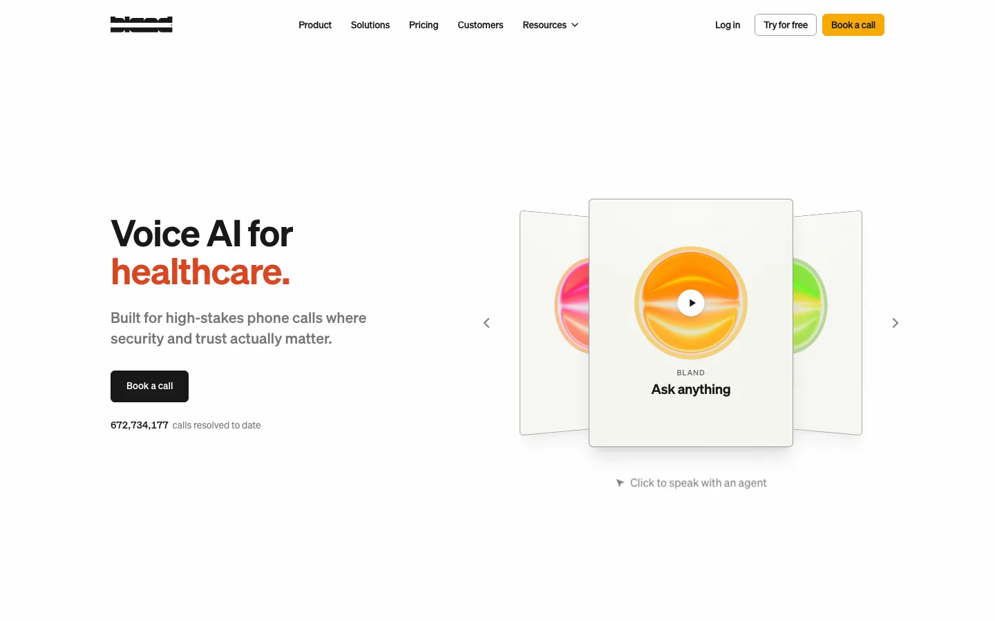
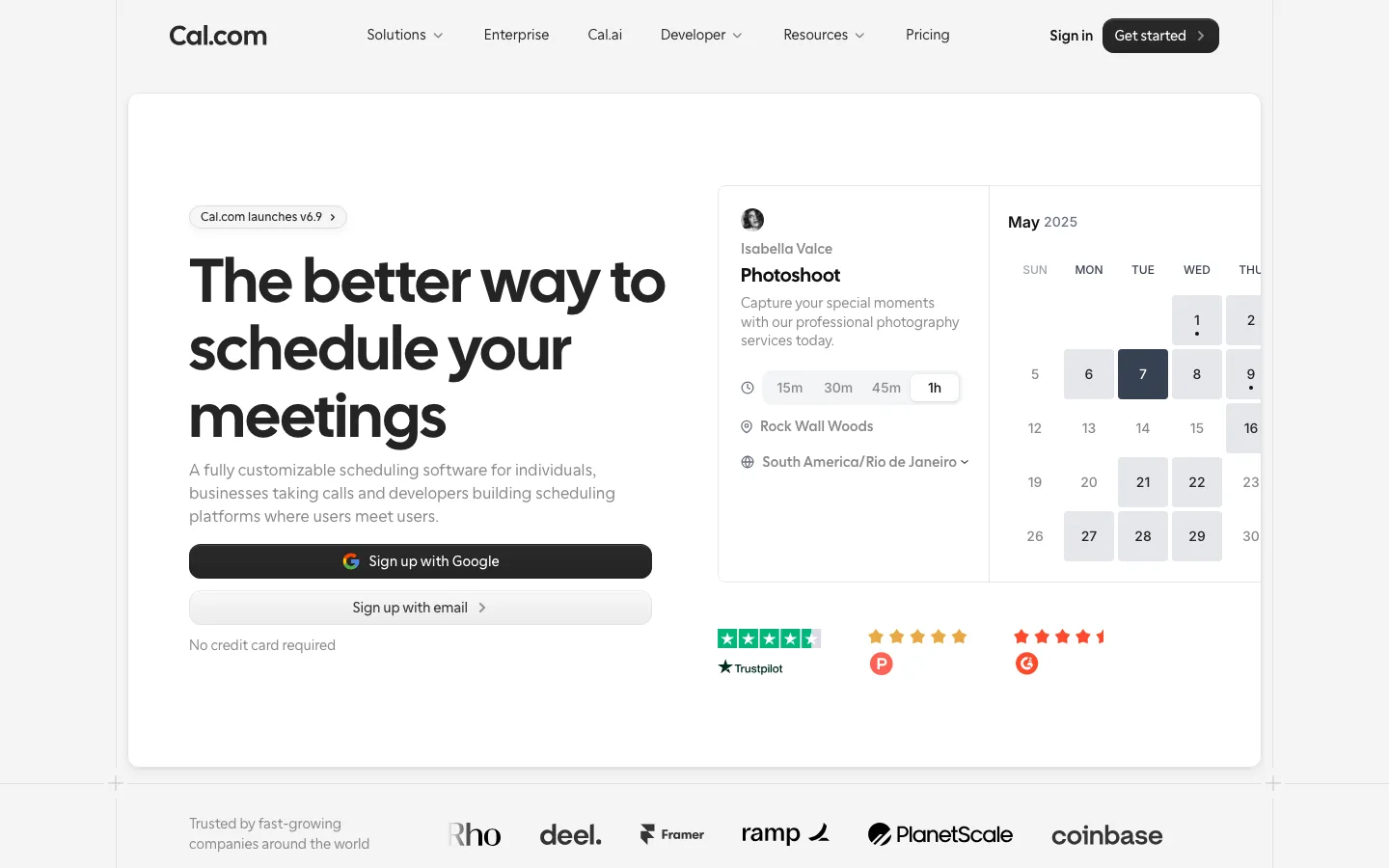
 12345678
Product shots framed against fine-art landscapes (painted mountains, lakes, hazy fields) in the same greige family as the page — the mock window sits *inside* a picture rather than on a gradient blob, which makes an IDE feel premium and calm.
Two-tone headlines: line one in #26251e, line two in a muted gray, same size and weight — hierarchy through color alone, no subhead needed.
Nav and hero use the same three-part button vocabulary: text link → outlined pill → filled near-black pill (Sign in · Contact sales · Download), repeated identically in the hero (Download for macOS ↓ · Request a demo →).
A 72px/400 display headline tracked −3% (−2.16px) with a 1.1 line height; the weight is regular, not bold, so authority comes from size and tracking.
Body copy at 13px system-ui inside the product mocks, matching real app density, so the screenshots read as genuine rather than upscaled marketing art.
A single small orange text link per section as the only saturated element; the gold Build badge as the only chip of color inside the UI.
The full-bleed section container is a soft gray card (#f0efeb-ish tonal step) with 8px radius on a #f7f7f4 page — tonal layering, no borders, no shadows on the sections themselves; shadows are reserved for the mock windows.
Arrows and glyphs (↓, →) set inline in the button label rather than as icons, so buttons stay pure type.
saas · landing · light · minimal, corporate-clean · calm, confident, technical, premium, serious