kobbe.io0views
Eight details, eight pinned.
View as Markdown ↗Sized by coverage · click to copy.
#1 Undetectable AI for Meetings
EB Garamond · 80/77 · 500 · -1px
Cluely takes perfect meeting notes and gives real-time answers, all while comple
Geist · 19/27 · 500 · -0.38px
Cluely listens in to the conversation
Geist · 28/35 · 500 · -0.5px
“A discounted cash flow model values a company by projecting future free cash fl
Geist · 12/19 · 400 · normal
“A
Geist · 12/19 · 400 · normal
Specimens are the page's own words at their measured metrics; shown in Inter when the family is not loaded.
 12345678
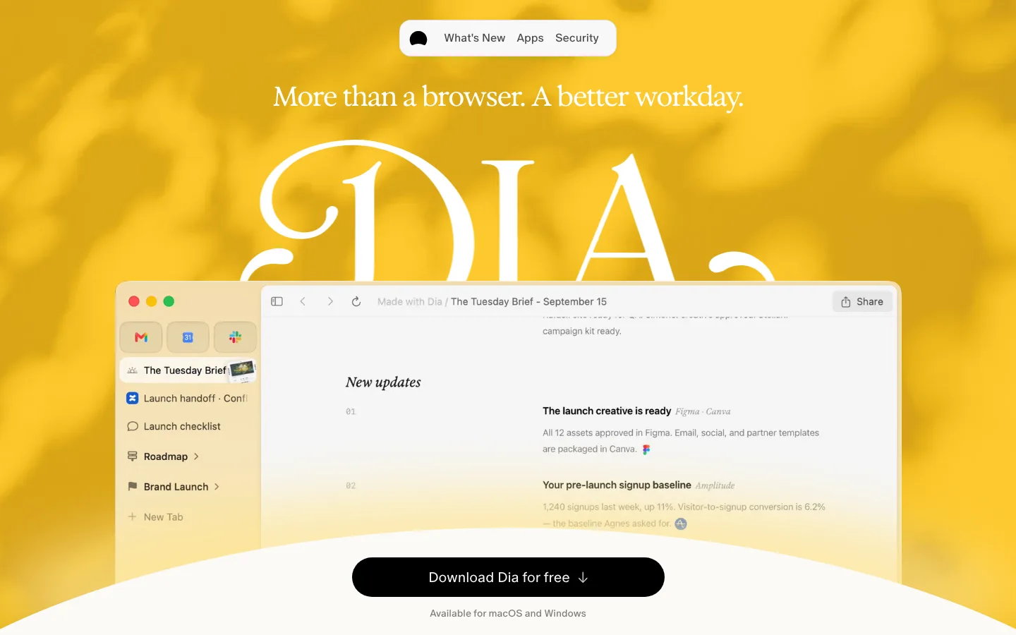
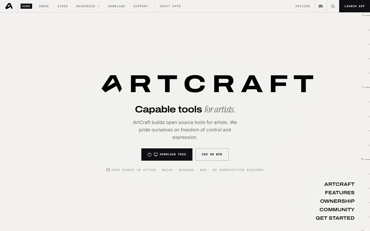
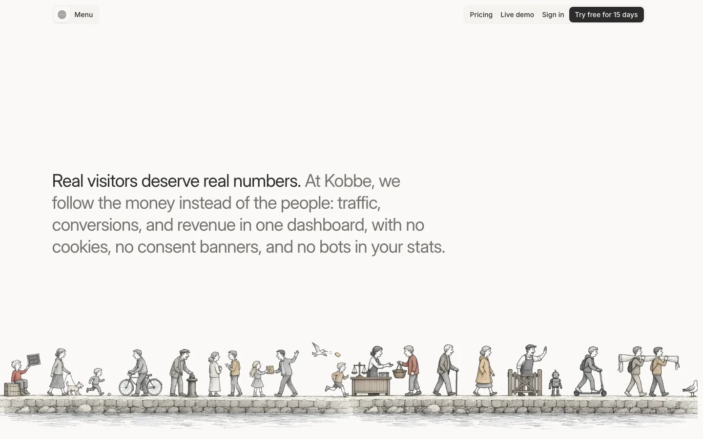
Literary serif display over a grotesk body — EB Garamond 500 at 80px with 76.8px line-height (0.96, tighter than the type is tall) and -1px tracking, while every other string on the page is Geist 400/500. The pairing is the entire brand and it costs two font loads.
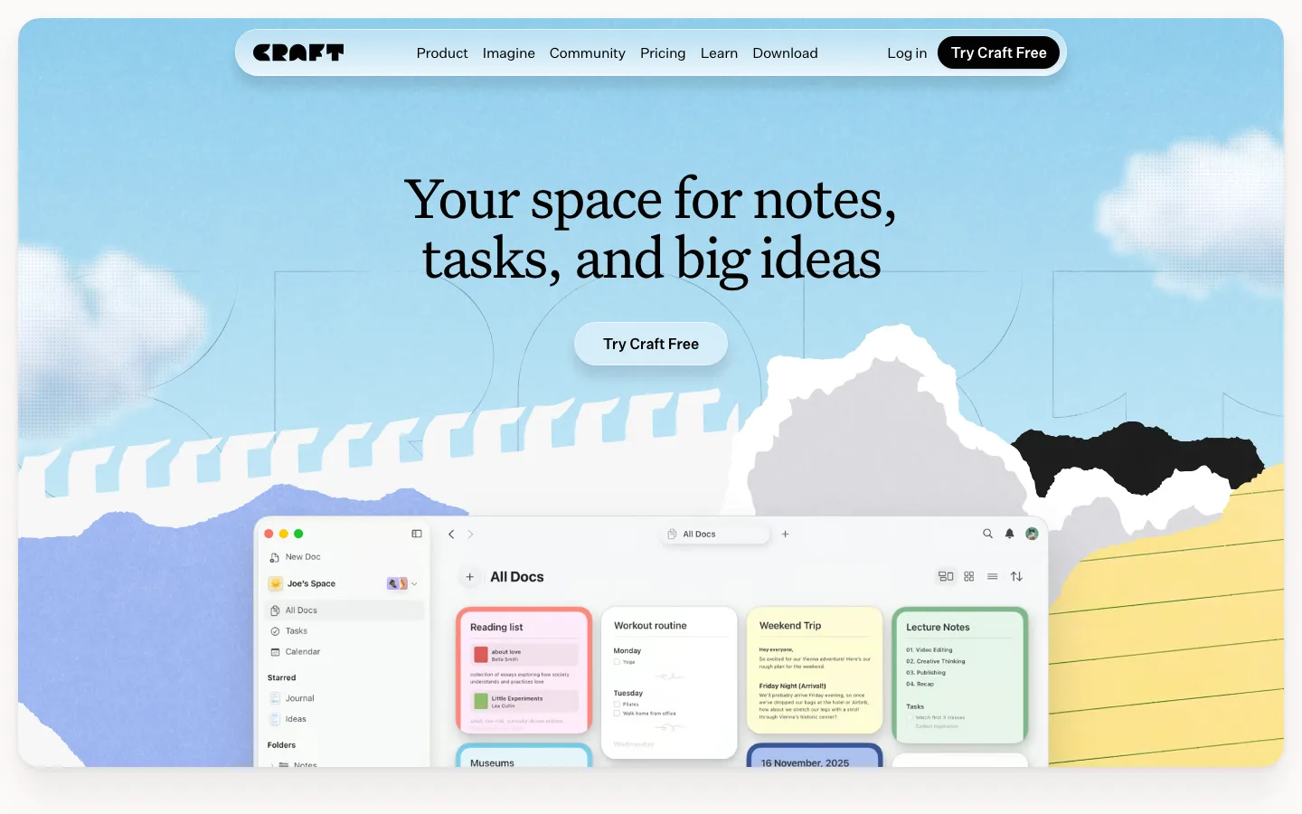
The hero is a painted scene, not a gradient — layered mountain silhouettes, a haze band and a blown-out sun disc at the right third, so the sky has a horizon line and a light source instead of the usual mesh blur. White type sits in the upper, darkest band where contrast is free.
A hairline rule between headline and subhead, cut to the subhead's measure — roughly 1px of white at low opacity spanning only the paragraph's width, not the container's, so it reads as a typographic flourish rather than a divider.
CTA as a saturated blue pill against the pale sky — #2f8fdc fill, 14px/500 label at -0.35px tracking, a leading Apple glyph, 9999px radius, and it is the single strongest color on the first screen. The same pill returns as a sticky top-right button once you scroll.
The product shot is deliberately cut by the fold — the app window begins inside the hero image and runs off the bottom of the viewport, so the first screen promises a second one instead of resolving.
Two-up explainer where one card is filled and its twin is outlined — a #4face5-to-blue tinted card beside a near-white #f5f8f6 one, same size, same radius, same internal screenshot. The fill alone carries the "before / after" reading without a label.
Every screenshot floats on a tinted slab rather than the page — a pale lavender-blue plate with a ~24px radius, the UI capture inset well inside it and given its own small radius, so the screenshot's rectangular edge never touches white. No shadow anywhere in the stack.
Stat rows with the unit demoted inline — "300" at display size with "ms" set maybe half that and baseline-aligned beside it, each row a number column, a 28px label and a two-line gray gloss, separated by full-width hairlines.
saas · landing · light · minimal, editorial, organic · calm, confident, premium, optimistic