lindy.ai0views
Eight details, five pinned.
View as Markdown ↗Sized by coverage · click to copy.
The AI product manager for your entire team
seasonMix · 86/82 · 400 · -2.16px
Overview
-apple-system · 15/23 · 700 · normal
LaunchDarkly's PM team ships 2x faster with ChatPRD
seasonMix · 22/27 · 400 · -0.56px
Turn ideas into clear requirements, coach your team to ship better products, and
-apple-system · 20/33 · 400 · normal
Start free
-apple-system · 13/20 · 600 · normal
Specimens are the page's own words at their measured metrics; shown in Inter when the family is not loaded.
 12345
12345The headline changes color mid-sentence, not by line: "The AI product" stays near-black and "for your entire team" runs a coral to pink to lilac gradient, so the break lands inside a phrase and the eye finishes the sentence chasing the color.
Display serif at 86.4px with 82.08px line height — leading *below* the font size (0.95) — and -2.16px tracking, at weight 400 only. The size does the work, so nothing is bolded and the three lines read as one shape.
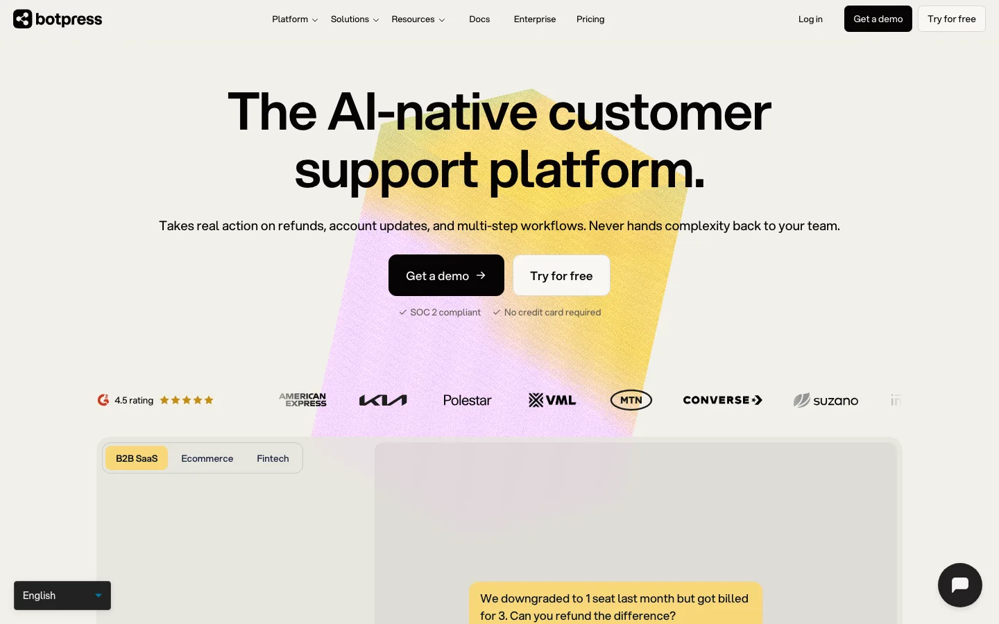
The two hero buttons are geometrically identical and differ only in fill: both 56px pills, 16px/32px padding, 16px/600 label. Primary is the gradient with a trailing arrow, secondary is white with a hairline border. Hierarchy from fill alone, never from size.
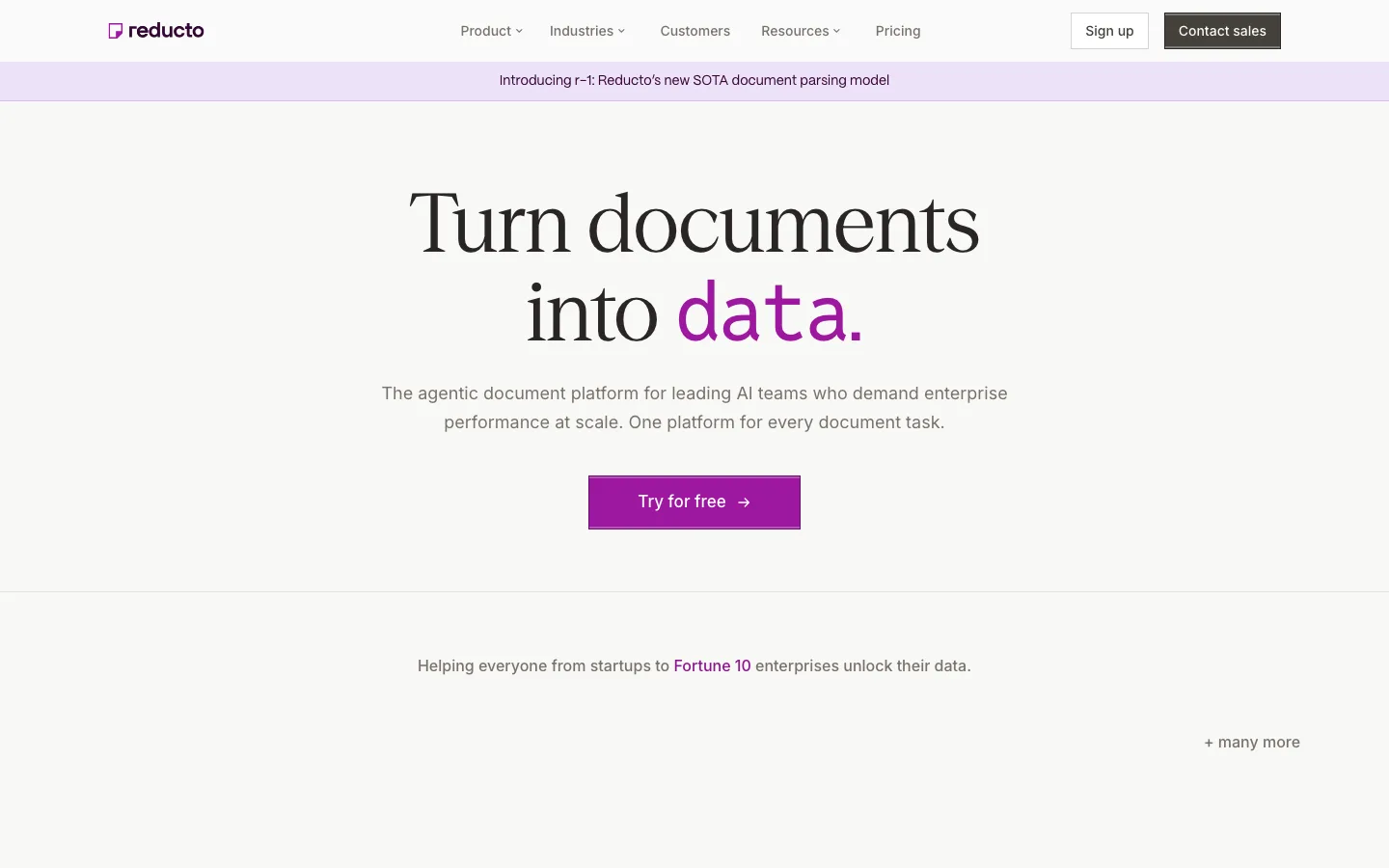
Announcement row above the headline: a coral uppercase NEW chip welded to gray sentence text and a small arrow, all inside one soft pill — a banner that costs one line and no bar.
Proof row of four stats with no cards, no dividers and no icons: figure in the display serif, label beneath in ~11px uppercase gray with wide tracking. Whitespace is the only separator.
Section eyebrows are numbered: a gray two-digit index, a short horizontal rule, then the label in coral uppercase with wide tracking ("03 —— INTEGRATIONS"). It gives a long page a table of contents without a sidebar.
Case-study cards split horizontally at the fold line: white top half carrying the logo, a serif claim and a coral metric; saturated lilac or orange bottom half carrying the quote in white above a hairline attribution row. One card, two grounds, one 16px radius.
Product screenshots are drawn as real UI, not illustration: a scorecard with a labeled green progress bar, a small "Great" pill and an 8/10 where the 8 is display-sized and the /10 is subscript-small.
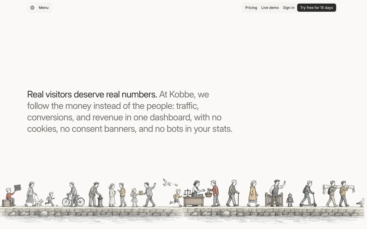
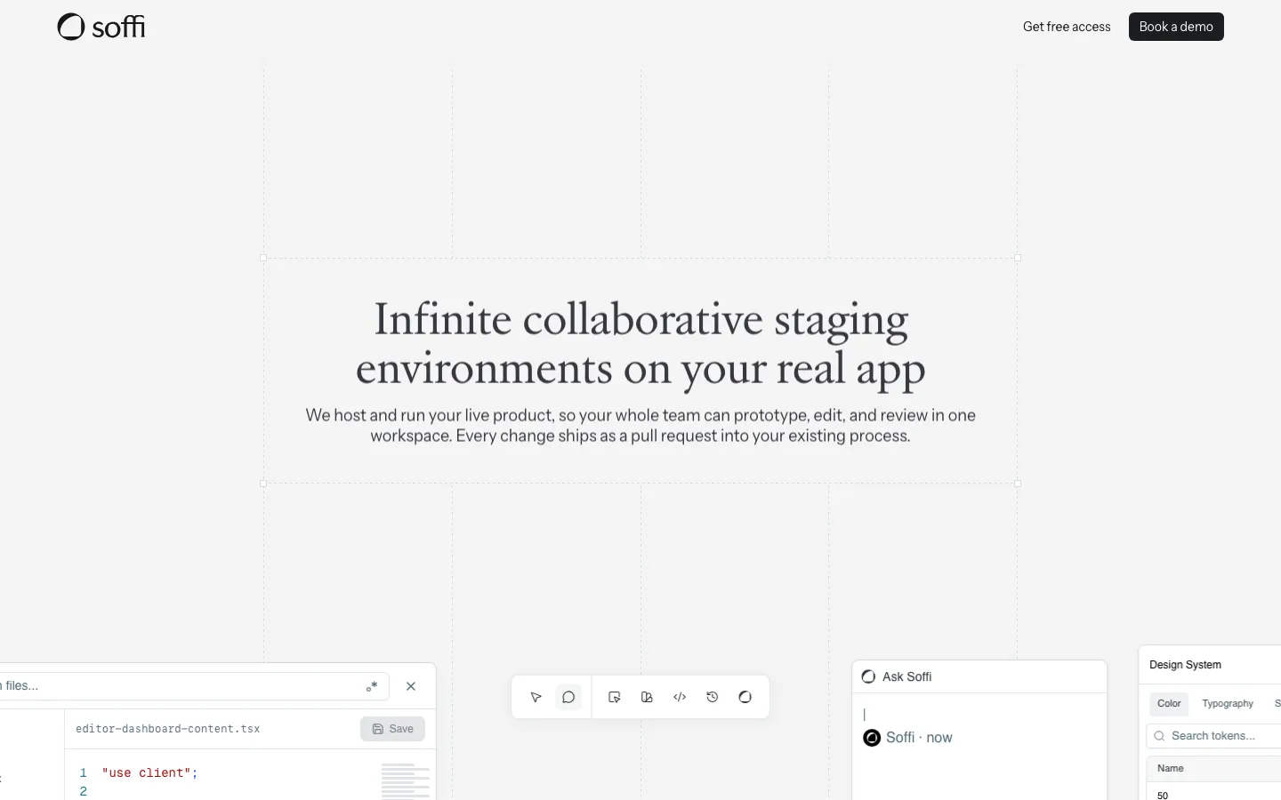
saas · landing · light · editorial, minimal · warm, confident, elegant, trustworthy