finnolivertaylor.com6views
Eight details, six pinned.
View as Markdown ↗Sized by coverage · click to copy.
東京 JST
Inter-SemiBold · 16/19 · 600 · -0.5px
Hello 👋
Inter-SemiBold · 36/43 · 600 · -0.8px
The Process
Inter-SemiBold · 17/19 · 600 · -0.5px
ID
Inter · 11/13 · 400 · normal
Specimens are the page's own words at their measured metrics; shown in Inter when the family is not loaded.
 123458
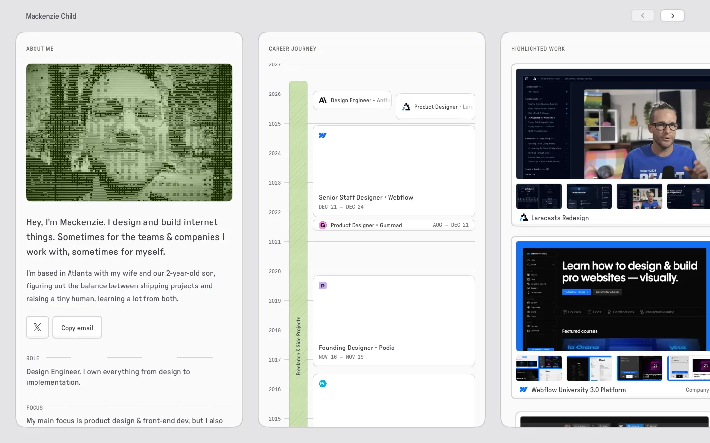
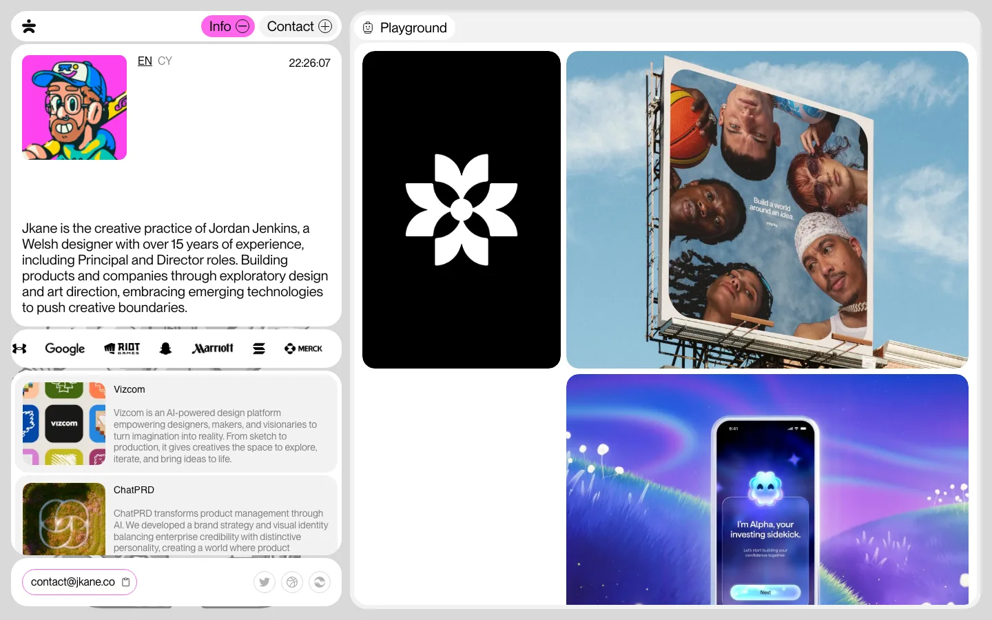
Two-tone card-on-ground system — the page is a flat #e6e6e6 field and every surface is a #f1f1f1 card at 18px radius with no border and no shadow; contrast between the two is about 5%, so the tiles separate by edge alone
Nav as circled-plus links in a two-column block — five items, each prefixed by a solid black filled plus glyph, stacked 3+2 at the top right instead of running as one horizontal bar; the filled circles are the only "UI" on the page
A header card that is mostly deliberate void — wordmark and nav at the top, the statement paragraph at the bottom, and roughly 200px of empty card between them; the emptiness is the composition, not a gap to fill
A live local clock as the only moving element — "東京 JST 10:12:49 AM" set 16px/600 at -0.5px tracking, bottom-right of the header card; it signals a person in a timezone rather than a company
Every card carries an archival slug line — capture date left, "ID" plus a zero-padded three-digit number right, 11px/400 in mid-gray, sitting inside the card's top padding above the image; the numbering counts down as you scroll
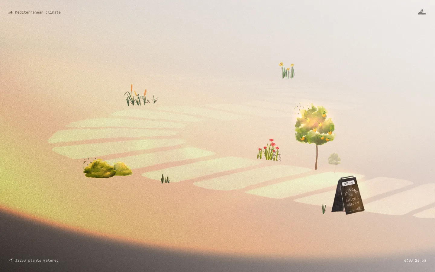
Masonry on a four-track grid where tiles span one or two columns — card heights are set by the artwork, not normalized, so a tall portrait sketch and a wide schematic sit in the same flow without cropping either
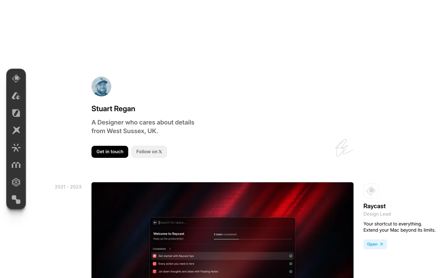
Three type sizes and nothing else — 36px/600/-0.8px for the two card headlines, 17px/600/-0.5px for nav and links, 11px/400 for metadata; every link is underlined rather than colored, which keeps the palette at zero hues
The footer is the header card run backwards — same off-white tile, same 36px greeting-style headline ("Ohhh that's the end"), the nav repeated as circled-plus links, then a hairline rule over an italic copyright and a "Made with love in Tokyo, JP" sign-off
portfolio · landing · light · minimal, swiss, playful · calm, human, raw, friendly