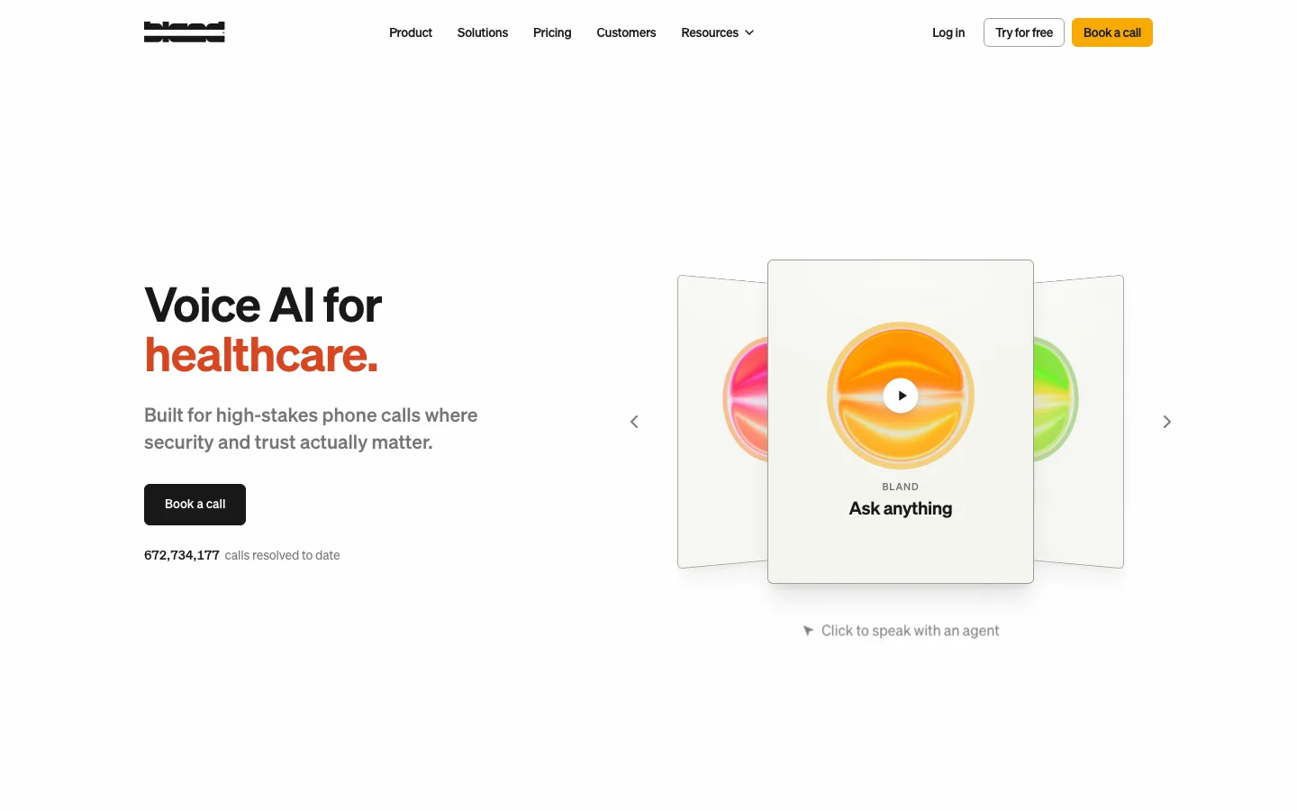
bland.com0views
Eight details, seven pinned.
View as Markdown ↗Sized by coverage · click to copy.
The better way to schedule your meetings
Cal Sans · 64/70 · 600 · normal
With us, appointment scheduling is easy
Cal Sans · 48/53 · 600 · normal
Connect your calendar
Cal Sans UI Variable Light · 18/23 · 300 · -0.2px
A fully customizable scheduling software for individuals, businesses taking call
Cal Sans UI Variable Light · 16/24 · 300 · normal
Cal.com launches v6.9
Cal Sans UI Variable Light · 12/12 · 300 · normal
Specimens are the page's own words at their measured metrics; shown in Inter when the family is not loaded.
 1234568
Hairline rules at #d3d4d4 run the full page height at the content column's left and right edges, cross a horizontal rule at each section break, and mark the intersection with a small + crosshair — a drafting reference that costs two 1px borders and reframes the whole page as measured
The hero is not laid on the page; it sits inside one raised white panel, 12px radius, inset ~130px from the viewport edge, lifted off #f4f4f4 by a shadow so diffuse it reads as depth rather than as a shadow
The hero art is a live, interactive booker — avatar, event title, a 15m/30m/45m/1h segmented control with 1h selected, location, timezone select, and a real month grid with available days tinted and the selected one filled near-black — instead of a product screenshot
The weight gap does the hierarchy: headings at 600 (64px/70.4px h1, 48px/52.8px h2, a tight 1.1 ratio) over body at weight 300, 16px/24px, in the same family — no color change, no size change, nothing but stroke thickness
Two CTAs stacked, not side by side, both the exact width of the text column: a solid #181818 pill carrying the Google glyph, then a #f5f5f5 pill with #292929 text at the same size, then a 12px #919192 reassurance line — a single-file decision ladder instead of a primary/secondary pair competing on one row
The announcement chip is 24px tall, 12px/400, #f5f5f5, fully pilled, with deliberately asymmetric padding — 4px 8px 4px 12px — so the trailing chevron sits tighter than the leading text
The header is chromeless over the hero — wordmark and links straight on the ground, no bar, no border — and on scroll it condenses into a detached white rounded bar inset from both edges with its own soft shadow
Color is quarantined inside product demos and borrowed marks: a lilac event block in the calendar mock, purple @handle links in the testimonial wall, the green and orange of Trustpilot, Product Hunt and G2. The page chrome itself never uses a hue
saas · landing · light · minimal, swiss, corporate-clean · calm, trustworthy, confident, technical