emilkowal.ski2views
Eight details, seven pinned.
View as Markdown ↗Sized by coverage · click to copy.
Brian Lovin
Inter · 24/32 · 600 · normal
Writing
Inter · 16/26 · 400 · normal
I'm a software designer living in San Francisco, currently making AI products at
Inter · 24/32 · 600 · normal
Specimens are the page's own words at their measured metrics.
 1345678
The bio is set at the same size and weight as the name — both 24px/600 Inter — so the sentence *is* the headline and the page needs no separate hero type at all
A two-step type scale with nothing in between: 24px/600 for identity, 16px/400 for section labels. Any row that is neither of those is a link, which makes the whole page scannable by size alone
Section labels are one light-gray 16px word plus a small chevron ("Writing ›") — no rule, no all-caps, no tracking. The chevron is the only thing telling you the label is itself a link to the archive
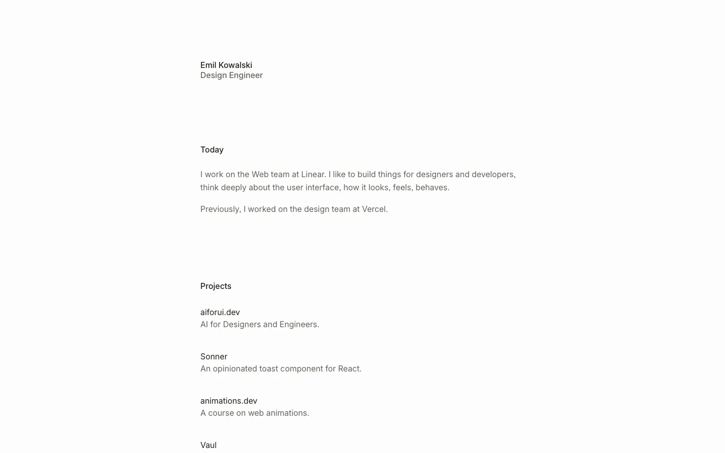
The content column is left-offset, not centered: it starts at ~28% of the viewport width and runs ~560px, so the empty right margin is wider than the text. Reads like a document, not a landing page
The entire nav collapses to a 12px two-line glyph in the top-left corner with no bar, no fill and no border — the header occupies zero vertical space and the content starts ~185px down instead
Project rows are two-tone on a single line: bold near-black label followed by a #959494 description with only a space between them. No dot separator, no second column, no wrapping — the gray is the separator
External destinations carry a small ↗ set between the label and its description, so internal and external links are distinguishable before you hover or read the status bar
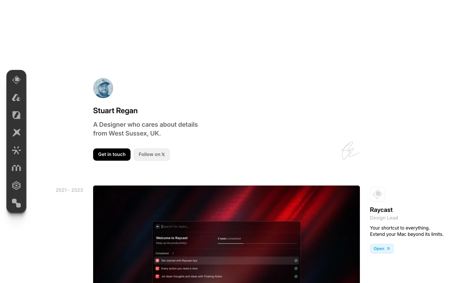
One 60px circular avatar at 9999px is the only image and the only radius on the page; the social row under it is three monochrome 20px glyphs at ~#959494, dimmed so they never compete with the writing list
portfolio · landing · light · minimal, editorial · calm, confident, human, technical