craft.do3views
Eight details, seven pinned.
View as Markdown ↗Sized by coverage · click to copy.
Tired of steering your coding agents?
Gelica · 60/60 · 500 · -1.5px
Your journey begins here
Gelica · 56/56 · 500 · -1.4px
All Your Agents, in Focus
SN Pro Variable · 22/29 · 700 · -0.66px
Rules, skills, hooks and corrections pile up in every harness. Blume sees the wh
SN Pro Variable · 19/28 · 400 · -0.285px
WE’RE HIRING
SN Pro Variable · 13/13 · 720 · 0.715px
Specimens are the page's own words at their measured metrics; shown in Inter when the family is not loaded.
 1234578
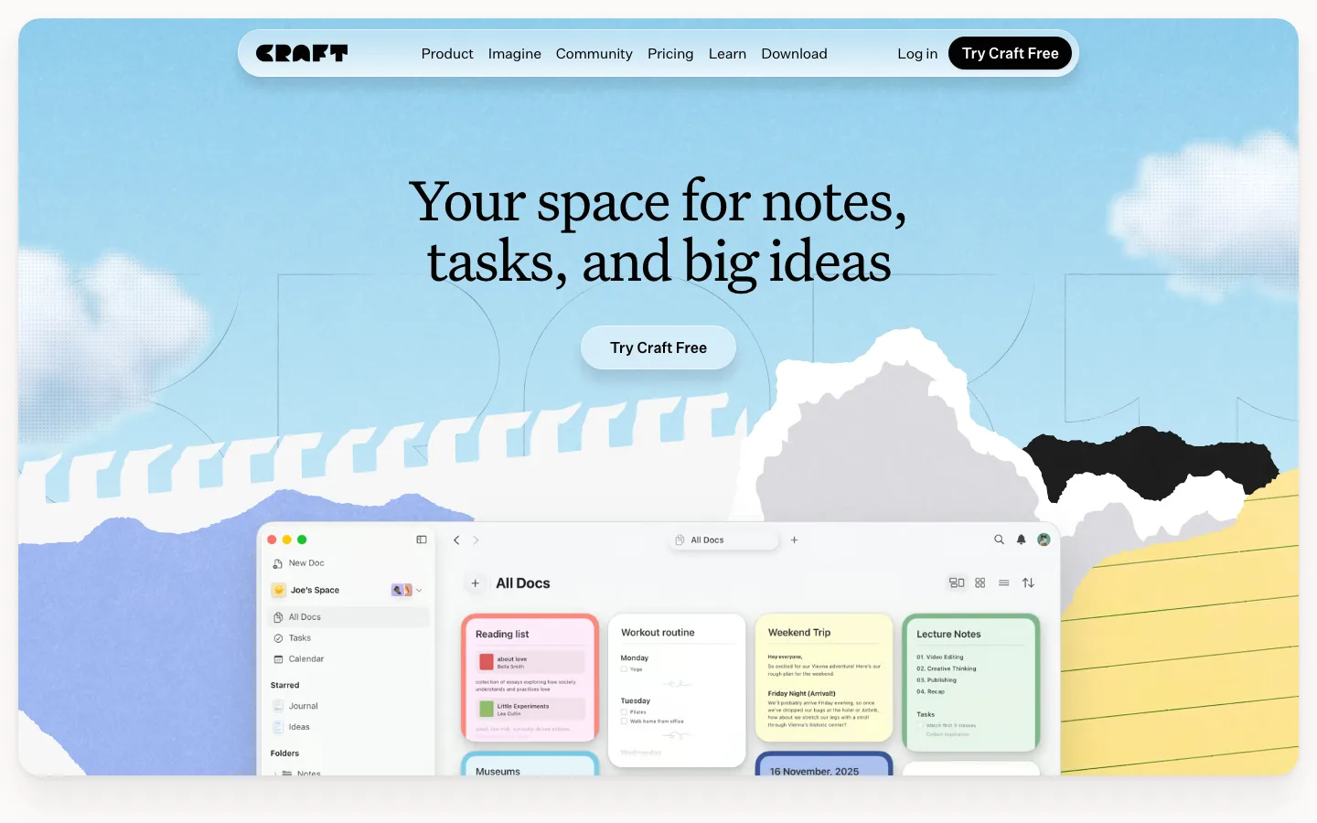
Full-bleed painted-sky hero with white serif headline centered on it and the product window rising from the bottom edge, partly cropped — the app is placed *in* the world, not on a card.
A single brand orange (#d55102) carries every interactive moment: logo glyph, CTA pill, corner ribbon, FAB. Everything else is cream, warm gray and illustration.
Pill CTA with a nested capsule tag inside it ("Download" + a small "DMG" chip), and a plain caption beneath ("Apple Silicon · v1.0.74") instead of a second button.
A continuous hand-drawn vine as the scroll spine: it links alternating feature blocks, carries leaf and flower-head markers, and doubles as the section divider.
Feature mockups are miniature cream app windows with traffic lights and rows of agent avatars, each one "planted" — grass tufts and an orange lily grow out of the frame's base.
Sticky top-center pill nav that appears on scroll: white capsule holding a text label ("Get Blume.") and the same orange CTA, nothing else.
Diagonal "We're hiring" ribbon pinned across the top-right corner, in the brand cream with orange dot and arrow — a physical-object gesture over a painted scene.
Heading serif (Gelica) at 500 weight rather than bold, so the display type stays soft and bookish over an illustration.
saas · landing · light · organic, retro-warm, playful · warm, optimistic, friendly, human, calm