phantom.com0views
Nine details, nine pinned.
View as Markdown ↗Sized by coverage · click to copy.
Build and ship native Swift apps with AI
ABC Favorit Variable Variable Regular · 88/92 · 400 · -4.4px
From idea to App Store
ABC Favorit Variable Variable Regular · 117/111 · 400 · -3.51px
Download for Mac
ABC Favorit Variable Variable Regular · 16/16 · 400 · 0.32px
Describe what you want to build, and Bitrig turns it into real Swift code you ca
ABC Favorit Variable Variable Regular · 20/27 · 400 · normal
Requires macOS 15+ and Apple silicon
ABC Favorit Variable Variable Regular · 12/20 · 400 · -0.24px
Specimens are the page's own words at their measured metrics; shown in Inter when the family is not loaded.
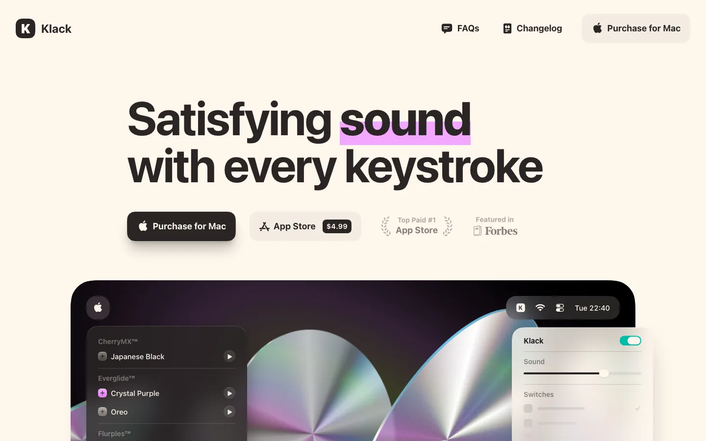
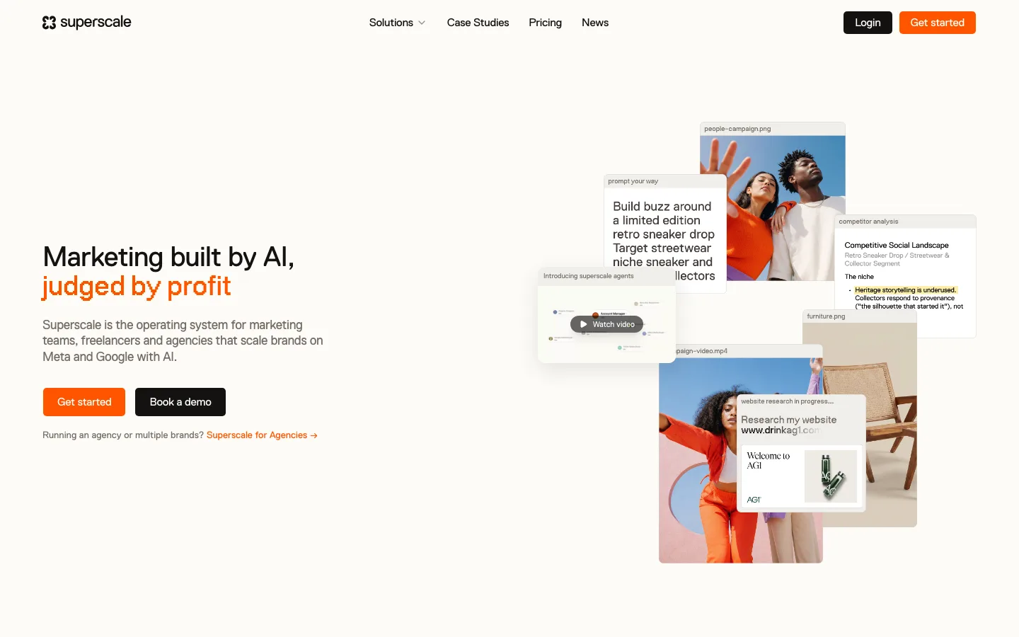
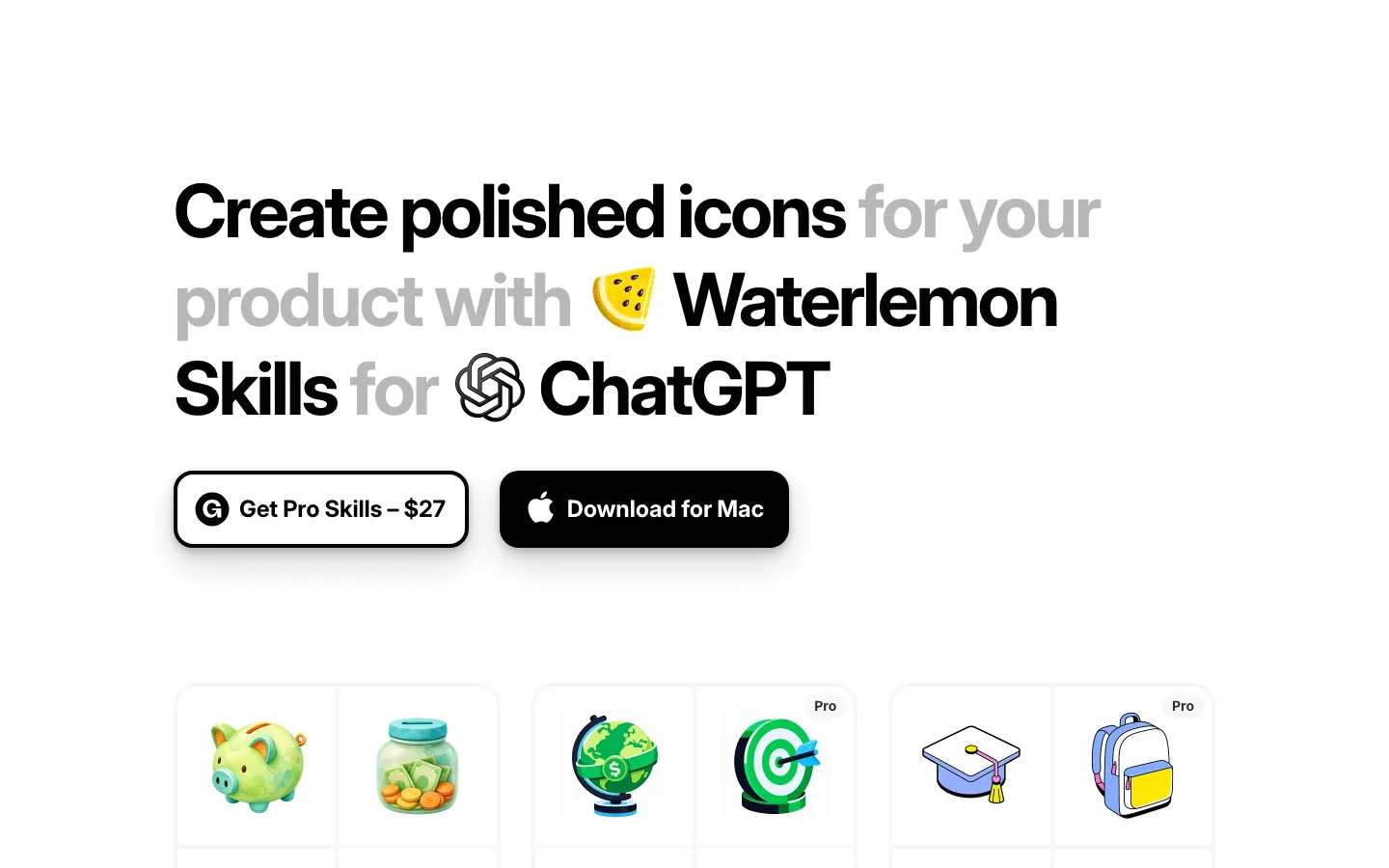
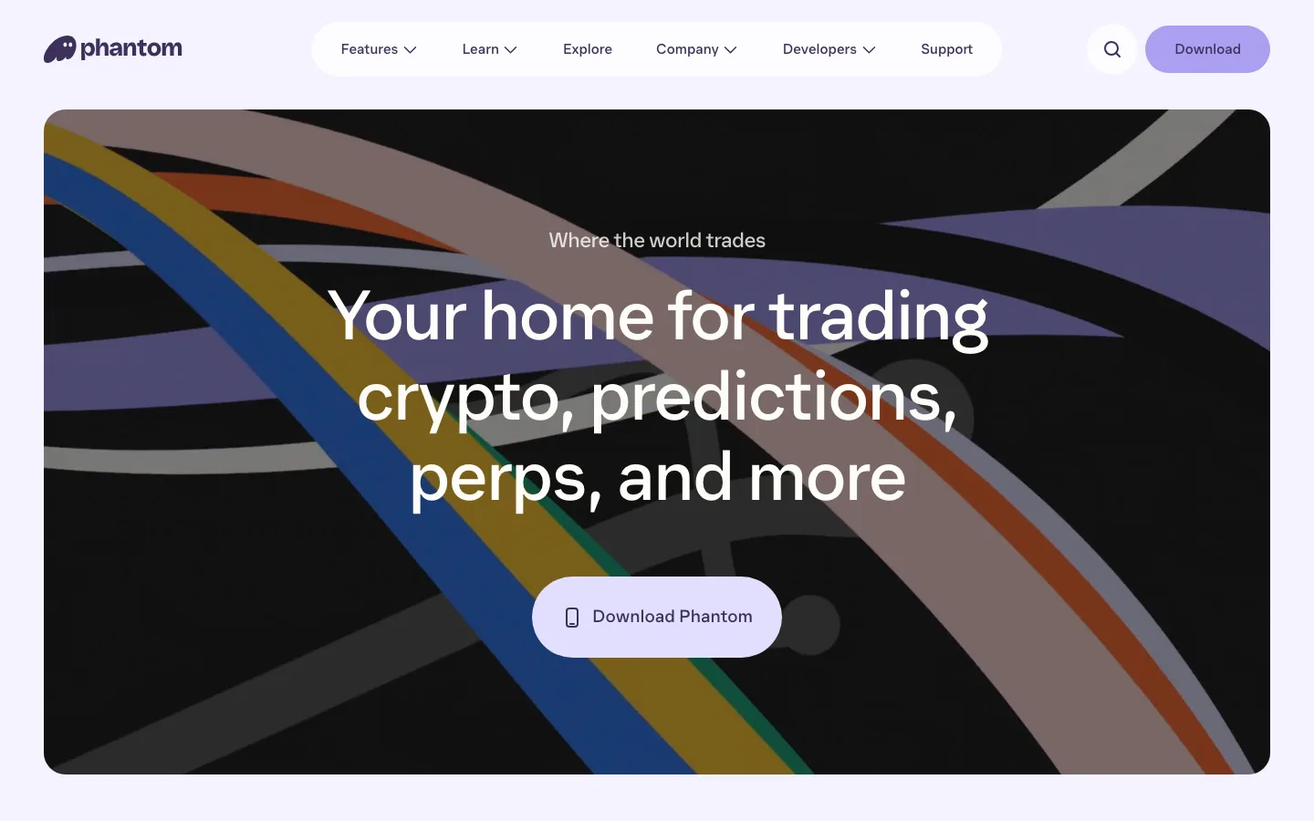
 123456789
An icon cascade as the hero image. Dozens of 22%-radius app icons hang from the top edge in staggered columns and taper into a V that lands on one larger brand icon. It says "native apps" without a screenshot and gives the eye an arrow pointing at the logo.
Frosted floating nav pill. A translucent capsule (999px radius, white about 60% with backdrop blur) holds a monospace-ish wordmark, a segmented "Mac" chip for the active item in solid white, gray links, and a black "Download" capsule at the end. It never docks to a bar, and it picks up the tint of every color band it passes over.
CTA fused with a capability strip. The black "Download for Mac" pill sits inside a wider white outlined capsule whose right half reads "Build for" followed by seven line-icon device glyphs (iPhone, iPad, Mac, Watch, TV, Vision). One shape covers both the action and the platform support, so no separate badge row is needed.
Credibility eyebrow under the logo. "From co-creators of SwiftUI" plus the Swift bird, set at 14px in gray between the icon and the headline. It is pedigree used as a kicker, and it is smaller than anything else above the fold.
Full-bleed gradient bands per feature. Each section gets its own saturated diagonal gradient (violet, orange to red, blue to purple, electric violet) with centered white display type, so the scroll is chaptered by color instead of by dividers.
A Liquid Glass prompt card over device mockups. A large frosted panel overlaps two phones and shows sparkle-prefixed suggestion chips in violet ("Active Pill", "Premium Card"), a big prompt line with the trailing word grayed, and a black circular send button with a cursor on it. The AI interaction becomes the hero object of the section.
A testimonial set as display type. The quote is italic Favorit at about 52px in white on electric violet, with the second half of each line faded to about 60% opacity, a giant outlined quote mark above, and only a round avatar and name for attribution.
A charcoal dotted-grid band for the companion app. The one dark section (#121312 to #322f3c) uses a faint dot matrix, so the "Remote" product reads as a different mode without leaving the system.
The icon cascade comes back as the footer cap. A short arc of the same app icons sits on the footer's top edge, closing the page with the image it opened on.
saas · landing · mixed · playful, glassmorphic, minimal · optimistic, energetic, friendly, confident, premium