fancy.design4views
Eleven details, ten pinned.
View as Markdown ↗Sized by coverage · click to copy.
WE CREATE
Freigeist Con · 120/108 · 400 · normal
MOBILE APP DEVELOPMENT
Plus Jakarta Sans · 44/53 · 500 · -0.44px
01 — Our Services
Inter · 18/19 · 500 · normal
Our Customers love to work with us, 40 Reviews
Inter · 16/19 · 500 · normal
4.9
Plus Jakarta Sans · 12/16 · 600 · -0.744px
Specimens are the page's own words at their measured metrics; shown in Inter when the family is not loaded.
 12345678910
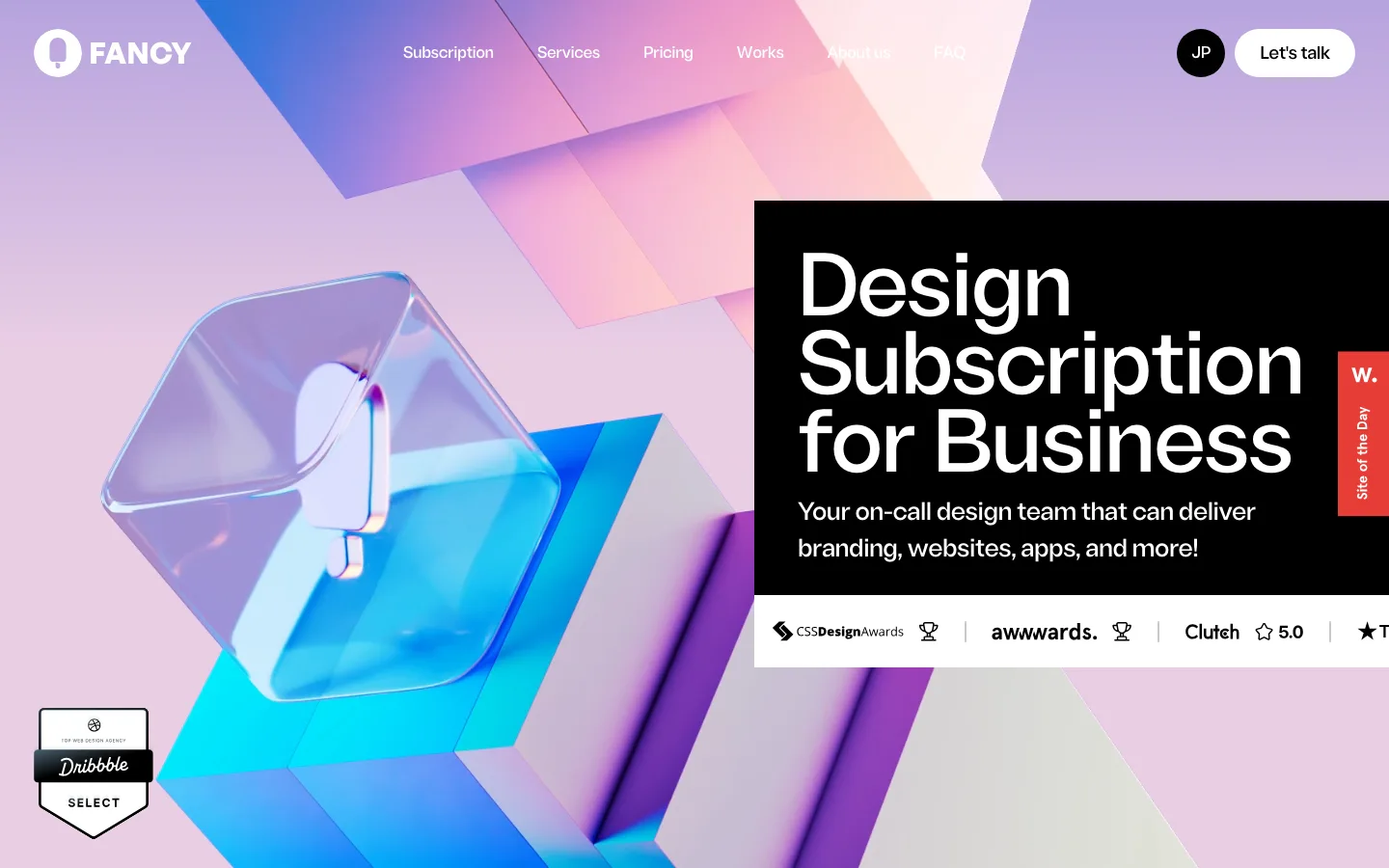
Hero headline that changes style line by line: thin upright, then heavy italic, then black upright, all in one condensed family at 120px/0.9. It reads as a typographic flourish without needing a second typeface
A white circle with a down arrow sits inline as a glyph in the headline's second line, so the scroll cue becomes part of the type
The whole hero is an inset card with ~33px corners and a 12px white gutter around it, so the first screen reads as an object rather than a full-bleed backdrop
Centered white pill nav with four plain text links, floating free of any header bar; the CTA and utilities sit as separate pills on the right
A right-aligned vertical section index (Home, Our Services, About Us…) in muted gray type inside the hero acts as a quiet in-page table of contents
Proof strip under a hairline rule: a white pill with Clutch stars and "4.9", then "GOLD VERIFIED" in low-contrast caps, then the review count in white
Circular "CLICK TO PLAY" text running around a play button turns the video trigger into a rotating badge
An oversized blue marquee line ("data driven user focused") runs edge to edge at roughly 3x headline size between the hero and the services
Portfolio cards inset a white caption tray with 30px corners at their bottom edge, holding a bold title and a gray circular arrow button, over a full-bleed screenshot
A stats headline swaps words for small pill-shaped image chips inline ("use Data [chip] Science to drive"), with the last line fading to light gray
The sticky CTA pill recolors from translucent white on the hero to solid electric blue over the dark sections, so it stays the loudest thing on screen
agency · landing · mixed · glassmorphic, bento · confident, futuristic, premium, playful