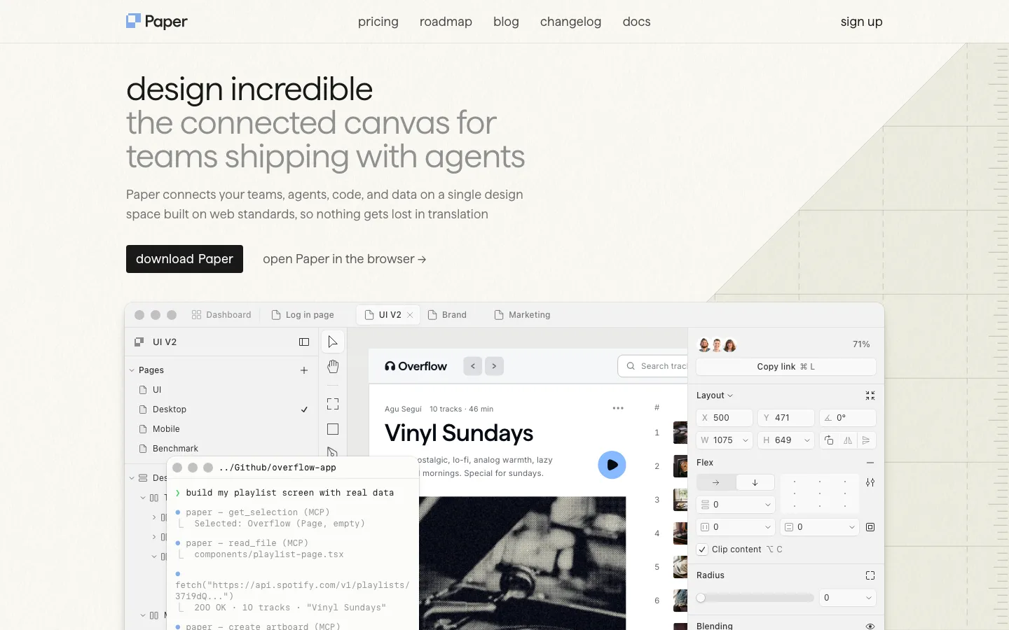
paper.design3views
Nine details, nine pinned.
View as Markdown ↗Sized by coverage · click to copy.
Design is fun again. Type, shaders and motion on one canvas. AI can help. You de
SF Pro Display · 56/60 · 500 · -1.68px
Controls come to you. Select something and its settings open beside it. Close th
SF Pro Display · 37/41 · 500 · -0.925px
Right-click anywhere. Tools open in a ring around the cursor. Select a layer and
SF Pro Display · 16/23 · 500 · normal
Specimens are the page's own words at their measured metrics; shown in Inter when the family is not loaded.
 123456789
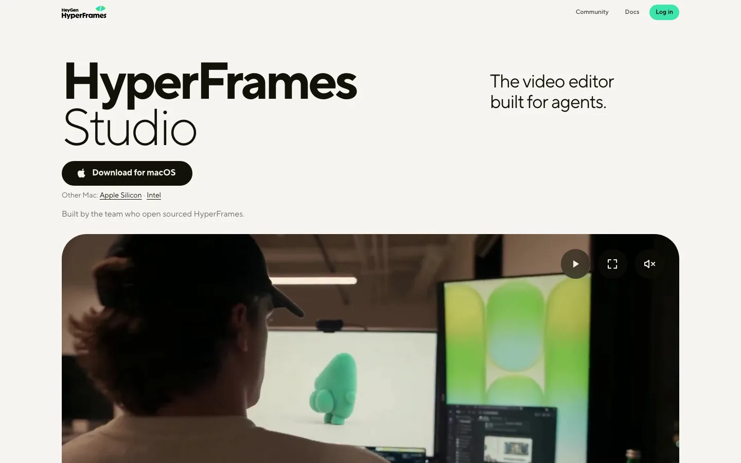
Two-tone headline: the first sentence in ink #141415, the rest of the paragraph continues inline in light gray #b0b0ae at the same 56px/500/-1.68px, so a whole pitch reads as one sentence plus a whisper. The same pattern runs on every h2 (37px, -0.925px)
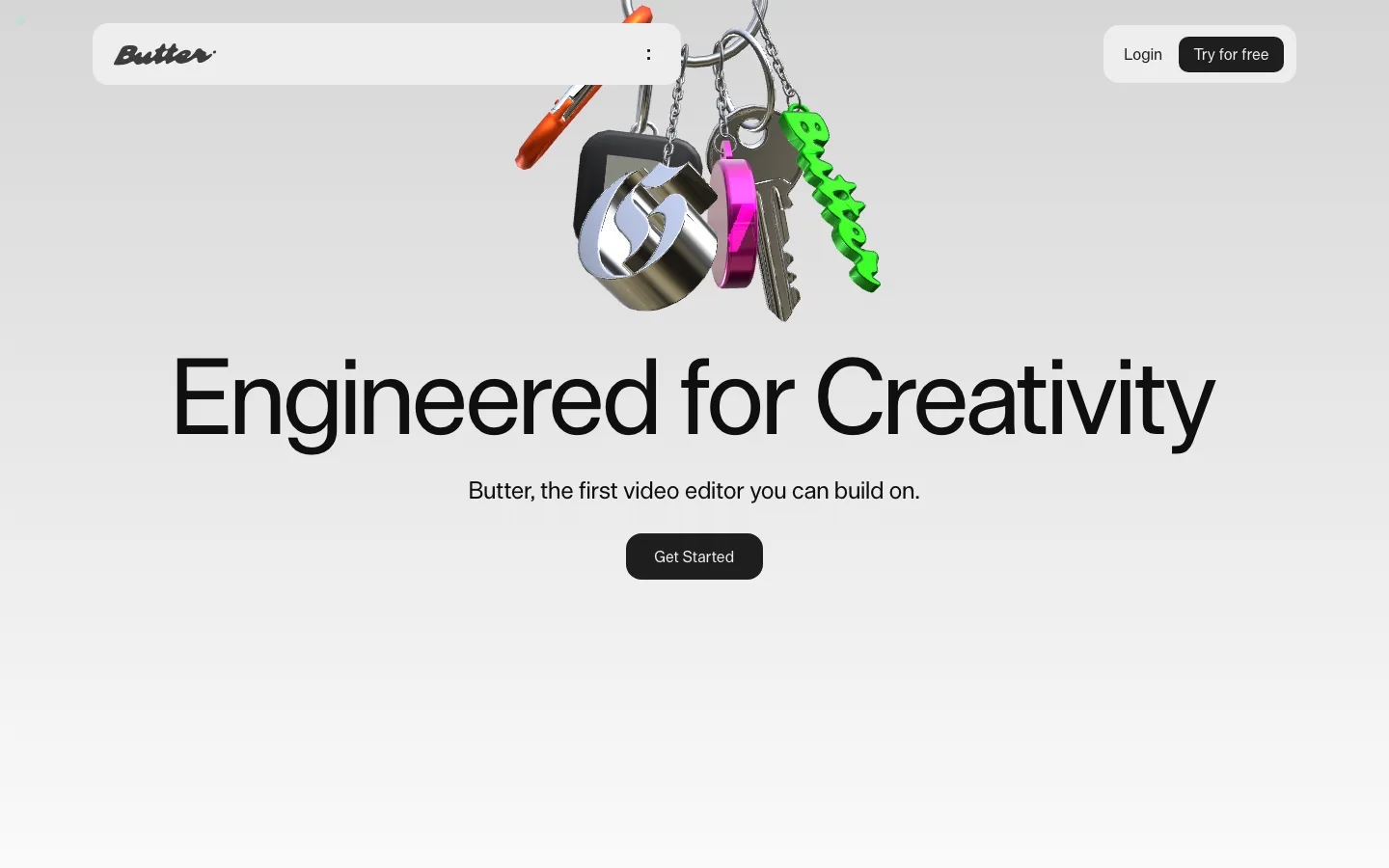
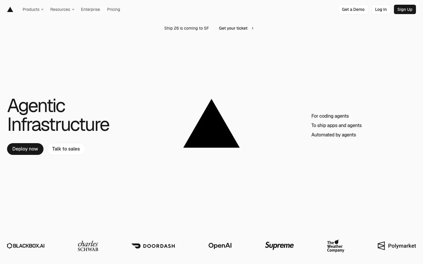
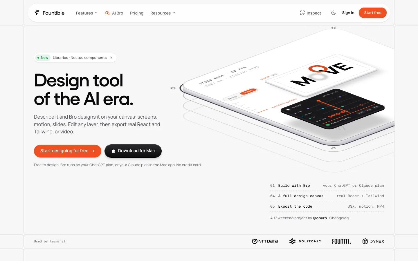
Floating pill nav inset 16px from the viewport edge, with a white fill, a 1px hairline and a 999px radius. Centered text links, a black pill CTA tucked inside the right end, and the bar goes translucent over imagery as you scroll
A three-step CTA ladder: a solid black pill (#111111, 15px/500, 16px side padding), a pale gray tonal pill for the secondary, then a bare gray text link with an arrow for the curious. Each step is quieter than the last
Product screenshots sit in a dark app frame placed inside a larger pale gray matte card with a 28px radius and 40px of padding, so a dark UI reads as an object on a table instead of a hole punched in a light page
A before/after photo split by a single 1px white rule, with tiny "Before" and "After" corner labels. It is an editorial alternative to a draggable comparison slider
Captions under every media block follow the headline's grammar: a bold ink lead ("Study 01."), gray specs that quote real parameter values, and a right-aligned underlined ".ascente ↓" link to download the source file
Three-up feature cards as flat #f2f2f0-ish tonal tiles with no border and no shadow. Each card's text is a bold lead phrase that runs straight into gray body copy
A shader demo card pairs a dark media half with a light text half, plus a row of small pill chips (one filled black, the rest outlined) that switch the example
An FAQ built as bare hairline rows with right-edge plus icons, with no cards and no fill, followed by a centered "Come play." sign-off and a single black pill
saas · landing · light · minimal, swiss · confident, calm, premium, technical