silt.app3views
Eight details, seven pinned.
View as Markdown ↗Sized by coverage · click to copy.
Copy the best trades
Pprightgrotesk · 100/80 · 900 · -1.9998px
Super app
Pprightgrotesk · 180/121 · 900 · -3.59964px
Backed by
Pprightgrotesk · 32/26 · 900 · -0.639936px
A place where genuine, unique, actionable conversations happen everyday. AfterHo
Passengersans · 18/25 · 400 · normal
Specimens are the page's own words at their measured metrics; shown in Inter when the family is not loaded.
 1234568
Headline scale as the identity: 180px / weight 900 / -2% tracking, two lines max, pure white on near-black; body stays a modest 18px/1.4 in a friendly humanist sans (Passenger Sans) so the contrast in scale is the whole hierarchy.
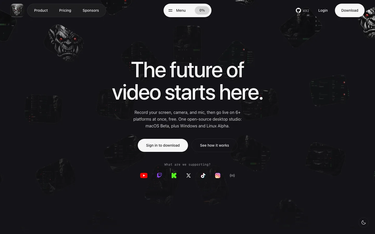
Floating, pill-shaped nav (fully rounded, dark translucent, four items) centered on the page with the primary action as a filled violet pill inside it; the logo sits loose at the far left and a bordered QR tile at the far right.
One-word feature headlines ("Feed") at display scale paired with a single emoji locked in a thick pastel ring — a branded icon system made from nothing but emoji + stroke.
Depth without shadows: blurred ghost duplicates of the emoji marks and dimmed, de-focused UI cards drift behind the main content, so the layers read as bokeh rather than elevation.
Yellow (#f5d90a-ish) used only as a highlight color in the eyebrow numbers and in the logo's smiley — a second accent that never becomes a button.
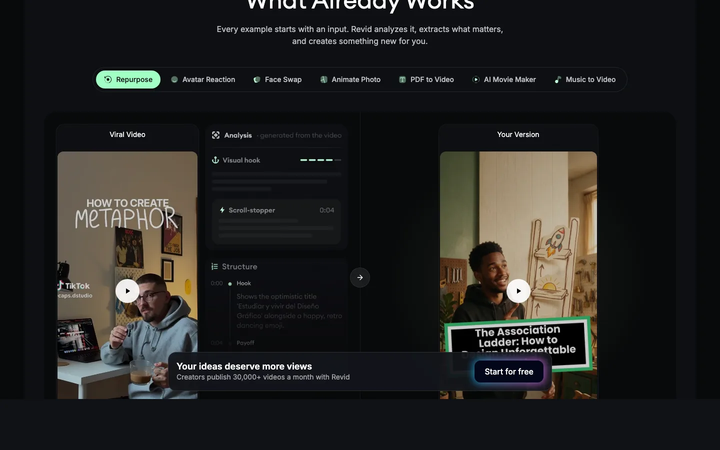
Product UI is the illustration: real feed cards with avatar, verified-balance badge, ticker chips in green, and tiny green/red sparklines in a rounded ticker card — the app's actual visual language sells the product.
The 12px panel radius (24 uses) vs 20px card radius vs full-round pills — three radii, each tied to a role.
Cheeky microcopy in the sub-heads ("puts their money where their mouth is", "yap in stock chat rooms") gives a finance product a group-chat voice.
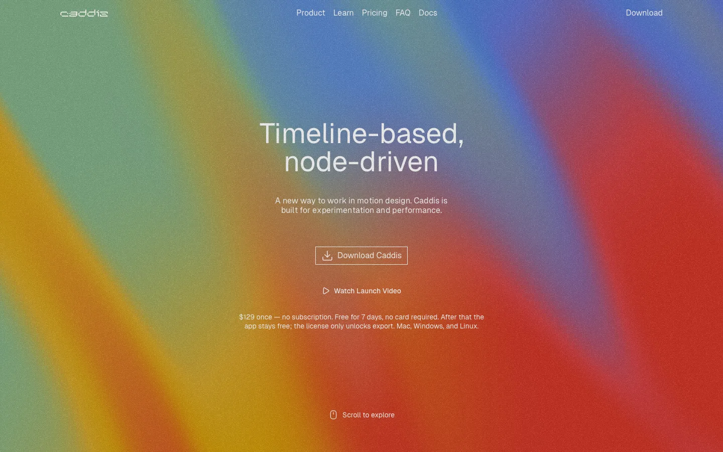
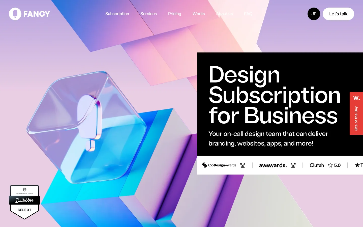
saas · landing · dark · dark-techno, playful · energetic, confident, playful, edgy, rebellious